Media & Theory
Notes on Japanese design
How centuries of Japanese aesthetics — composition, color, restraint — translate into mechanisms you can build into a modern website.
- Media & Theory
2026-10-22
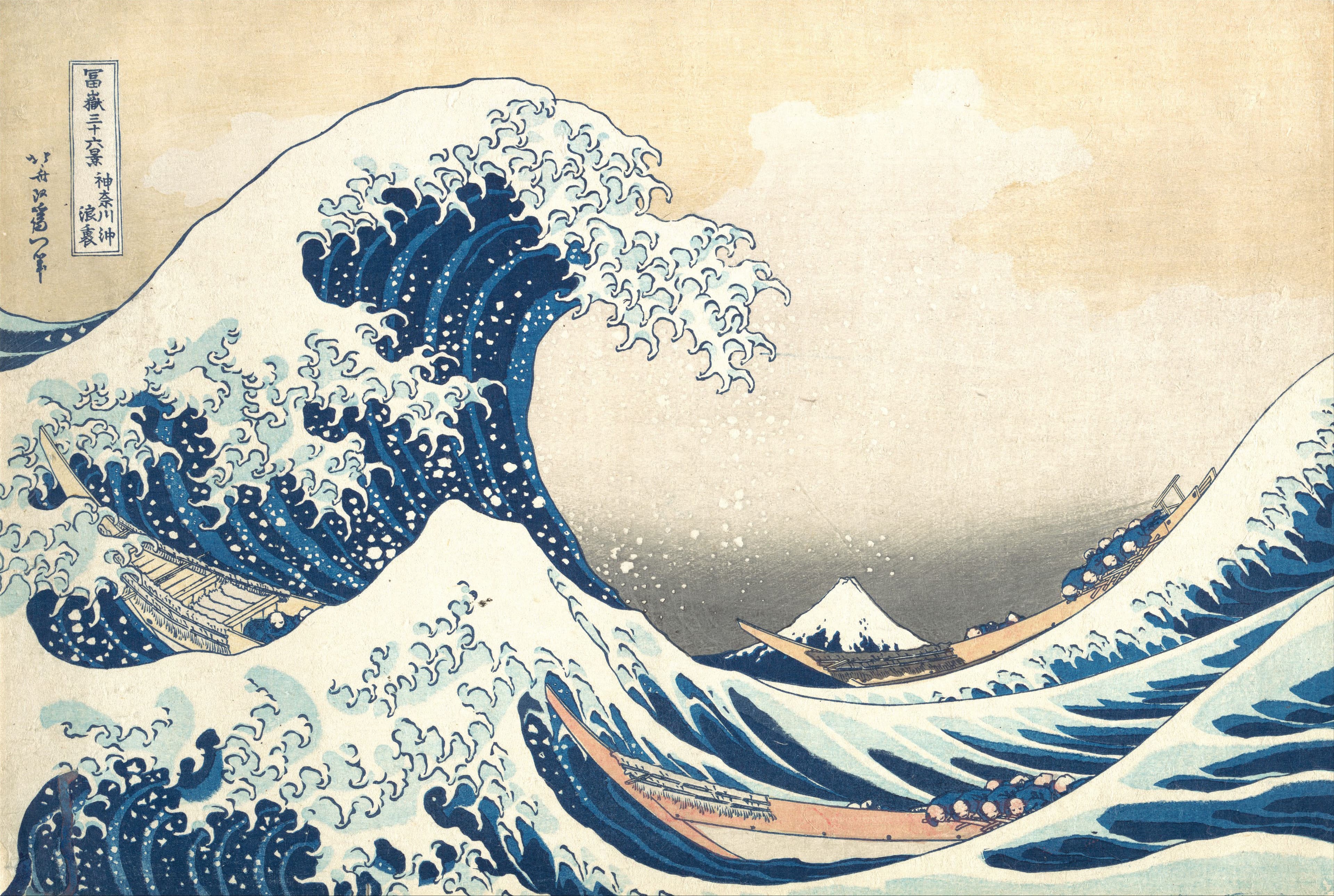
Hokusai Blue Is Never Just One Blue: Designing Tonal Scales That Shift in Hue
At a glance, Hokusai's blue looks like a single blue. But indigo shifts in hue as it deepens, and that movement gives it depth. Let's bring it into a screen palette.
- Media & Theory
2026-10-14
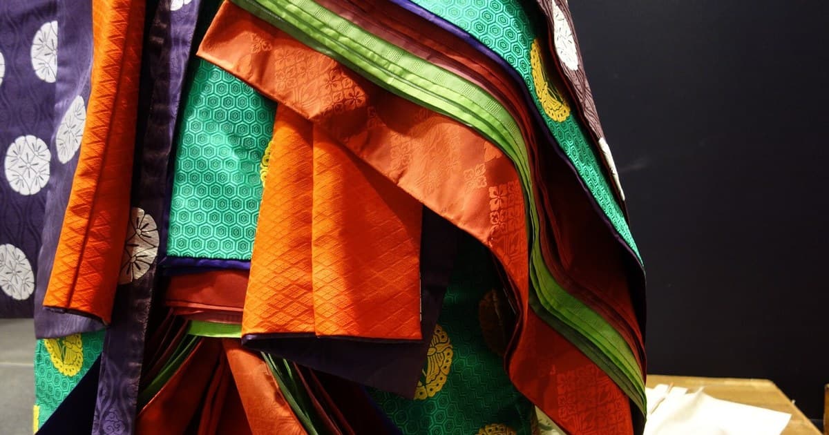
Color Isn't Chosen, It's Layered: Designing Translucent Color from the Kasane Palettes
We usually pick colors one at a time. Heian court ladies designed the color that appears when two layers overlap. Let's see what that idea looks like on screen.
- Media & Theory
2026-10-07
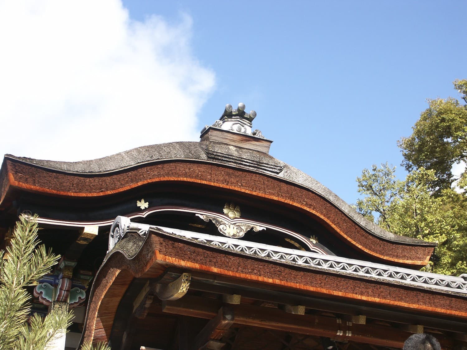
A Curve Is Time, Not Shape: What Terimukuri Teaches Web Animation
We tend to think of a curve as roundness. The defining curve of traditional Japanese design is something else: a dip, then a rise — a shape that turns out to be a movement in time.
- Media & Theory
2026-10-01
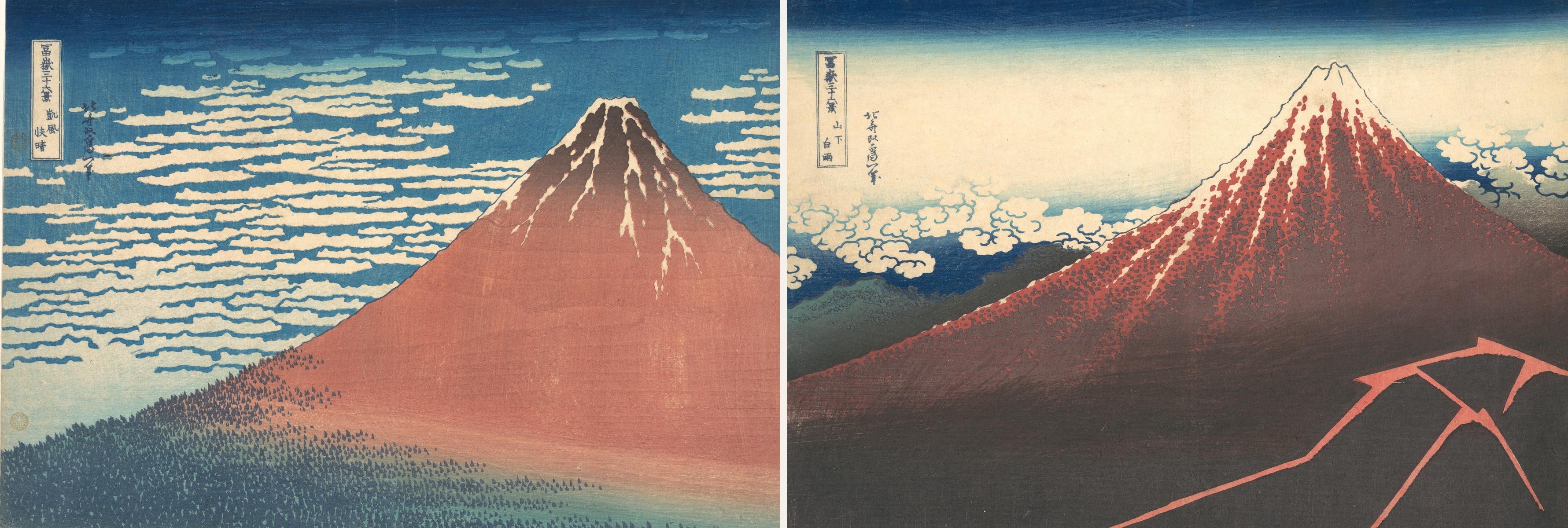
Same Mountain, Opposite Mood: Hokusai's Case for Designing Emotional Weight
Two paintings of the same mountain, built on the same skeleton — yet one feels calm and the other feels like it's about to fall apart. Here's what Hokusai changed, and how it translates into a hero section.
- Media & Theory
2026-09-24
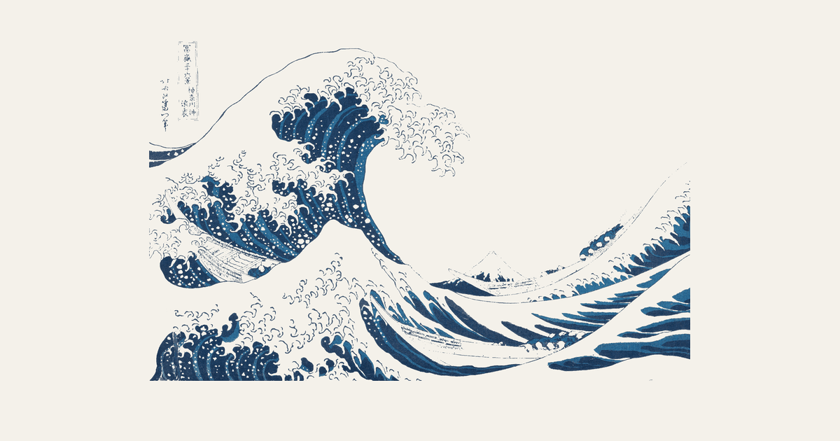
The Great Wave Is a Wireframe: Hokusai's Grid for Guiding the Eye
Two centuries before 'above the fold' had a name, Hokusai had already worked out exactly where your eye should land — and in what order.