
Two centuries before "above the fold" had a name, a Japanese printmaker had already worked out exactly where your eye should land — and in what order.
1. The hook
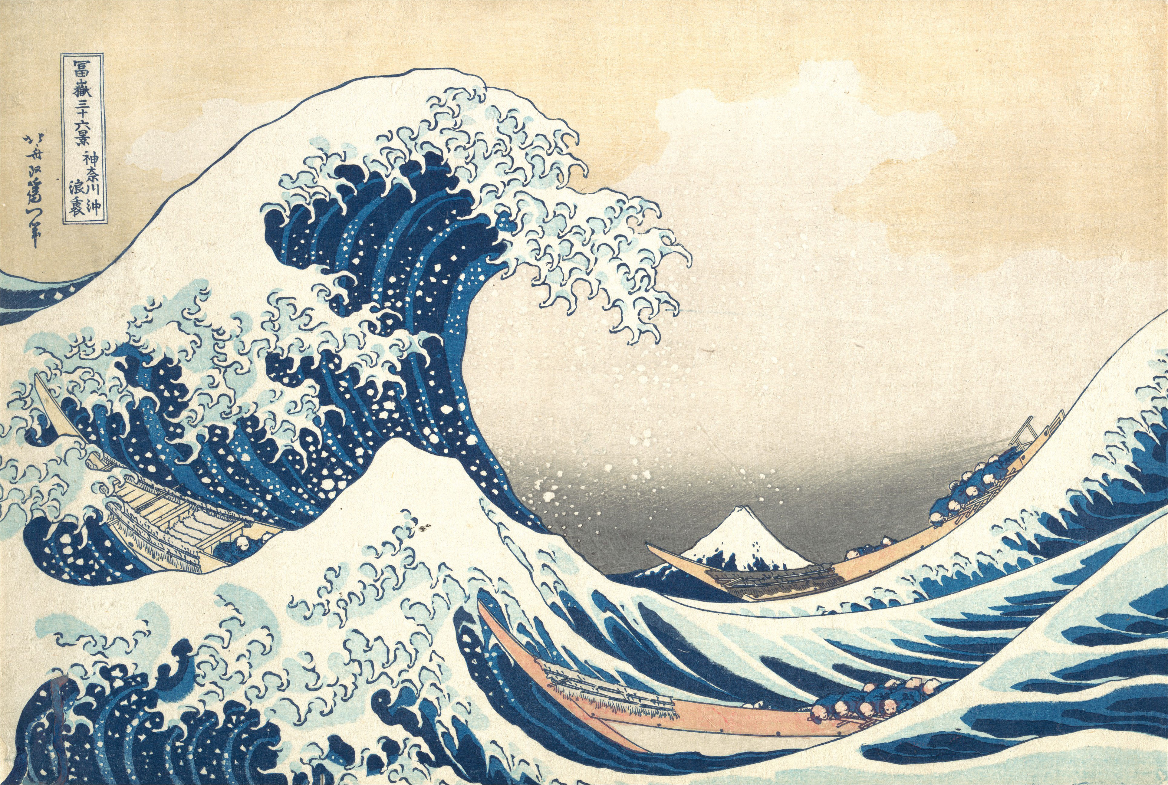
You know this image. Even if you've never set foot in a museum, you've seen Katsushika Hokusai's The Great Wave off Kanagawa — on a mug, a phone case, a skateboard deck, a thousand knockoff prints. It may be the most reproduced image in the history of art.
What almost nobody tells you: it isn't just a beautiful wave. It's a diagram. Hokusai built it the way an engineer builds a bridge — with a system, not a feeling. And that system translates, almost without modification, into how you should be laying out the first screen of a website.
2. It's not a retrofit — Hokusai wrote the method down himself
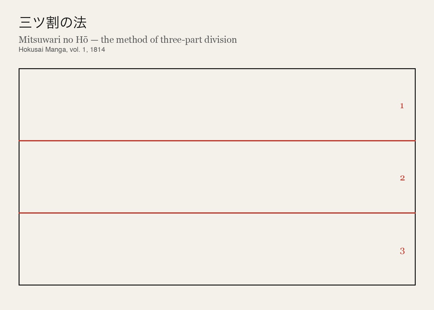
Here's the part that surprised me. This isn't a grid a modern eye projected onto an old painting, looking for patterns after the fact. Hokusai wrote the method down himself. In Hokusai Manga (北斎漫画), the sprawling 15-volume sketchbook-encyclopedia he began publishing in 1814, there's a page titled Mitsuwari no Hō (三ツ割の法) — "the method of three-part division." A simple diagram: divide the picture into three horizontal bands.
Sound familiar? It sits uncomfortably close to the rule of thirds every design student learns on day one, and to the golden-ratio division Western painters had leaned on since antiquity. Hokusai was working inside a Japan largely closed off from the West for most of his life. Whatever route he arrived by, it wasn't by copying a Western textbook — he landed on a structurally similar answer on his own, and left the instructions in writing.
3. Reading the grid on the wave itself
So let's apply his own instructions to his own most famous image.
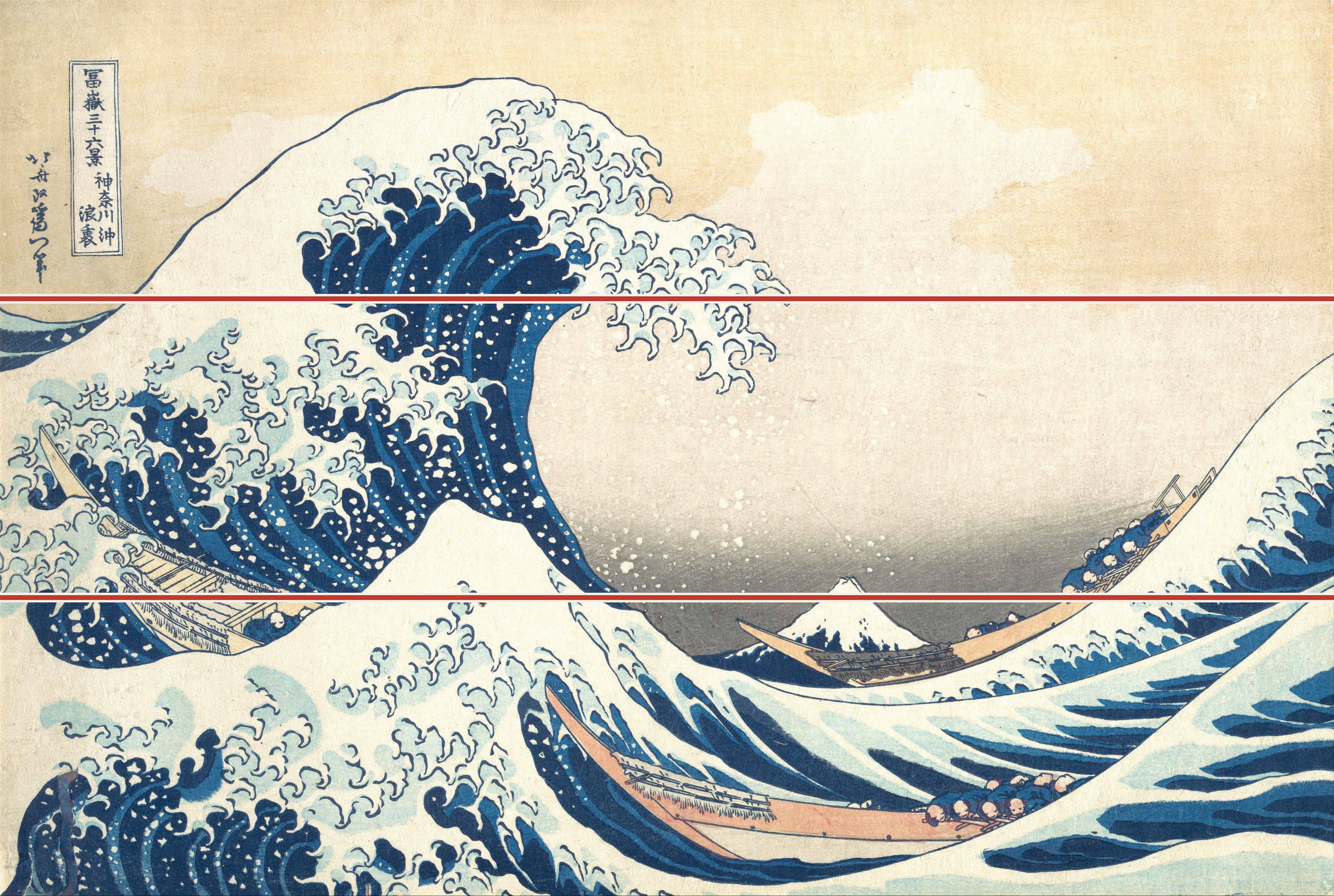
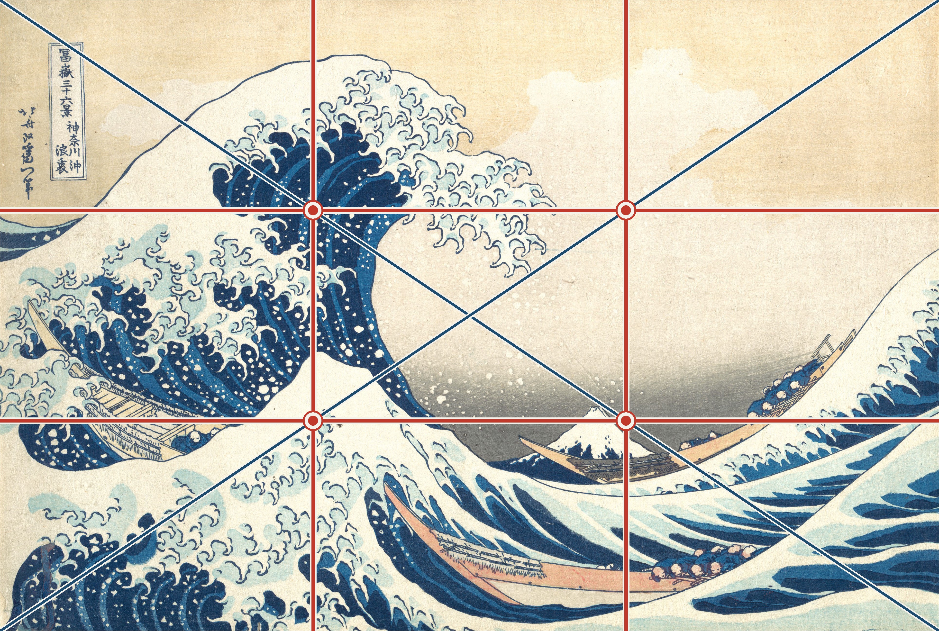
Draw the three horizontal bands Hokusai specified. Already the composition starts to organize itself — the crest of the wave sits right on the upper band.
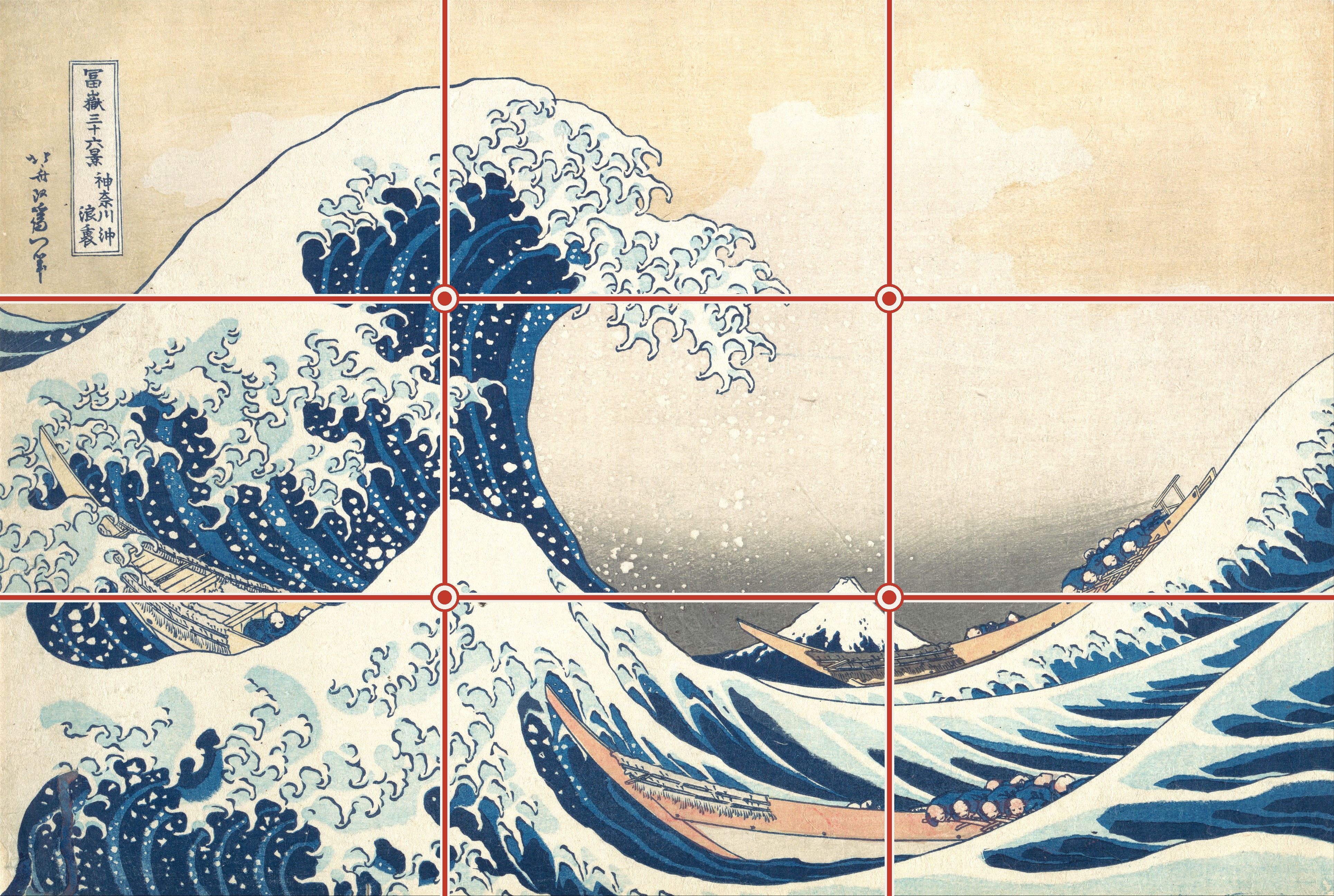
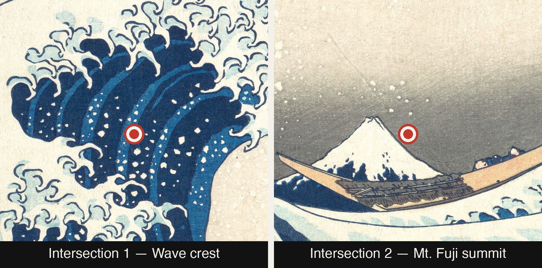
Now add the vertical thirds — the second half of what any working designer would recognize as a 3×3 grid. Four intersection points appear. Look at where they land: the upper-left intersection sits almost exactly on the foam curling off the top of the wave. The lower-right intersection lands, with very little room for coincidence, right on the snow-capped peak of Mount Fuji, sitting calm in the background.
Two elements. Two intersection points. The two most important things in the entire composition, sitting exactly where a 3×3 grid says they should — decades before anyone in Japan called this a "rule" of anything.
4. The diagonal, and the composition it creates
Once you've drawn the grid, the diagonal is the next line any compositional analysis reaches for — corner to corner, same move we just made with thirds. Draw it across the Great Wave and something becomes visible: the crest of the wave and the peak of Fuji sit almost exactly along this diagonal axis, opposite corners of the same line.
A diagonal composition isn't a neutral choice. It's the classic way to build directionality into a still image — a sense of motion cutting through the frame, instead of a grid holding everything politely in place. Here, it pulls the eye from the lower-left, up and through the wave, out toward Fuji in the upper right. Hokusai uses this same diagonal logic elsewhere in the series — it isn't a one-off move he stumbled into here.
He reinforces it with a second decision. The horizon — where sea meets sky — sits low in the frame, roughly at the height of Fuji's base, not where a calmer composition would place it. A lower horizon lowers the implied viewpoint of the viewer, which makes everything above it read as taller, closer, more overwhelming. Combined with the diagonal, it's what gives the wave its sense of force: not just placed well, but staged to loom.
5. Same Layout. Different Composition.
Take the most common hero section on the web: an image on one side, a headline and a button on the other, everything centered top to bottom. It isn't wrong. It's just the default — the layout a template reaches for when nobody has told it to reach for anything else.
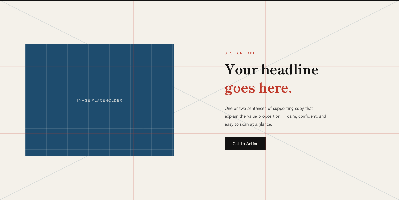
Now apply exactly what the last two sections just showed you, to the same two elements, without adding a single thing:
- Weight the image toward the upper anchor — not centered in its column, but pulled up, the way the wave's crest sits high and to one side in the grid.
- Weight the headline toward the lower anchor — pulled down, the way Fuji sits low and calm in the frame.
- Let a diagonal pull carry the eye between them — the same directional pull that carries the eye through the painting, from one anchor to the other.
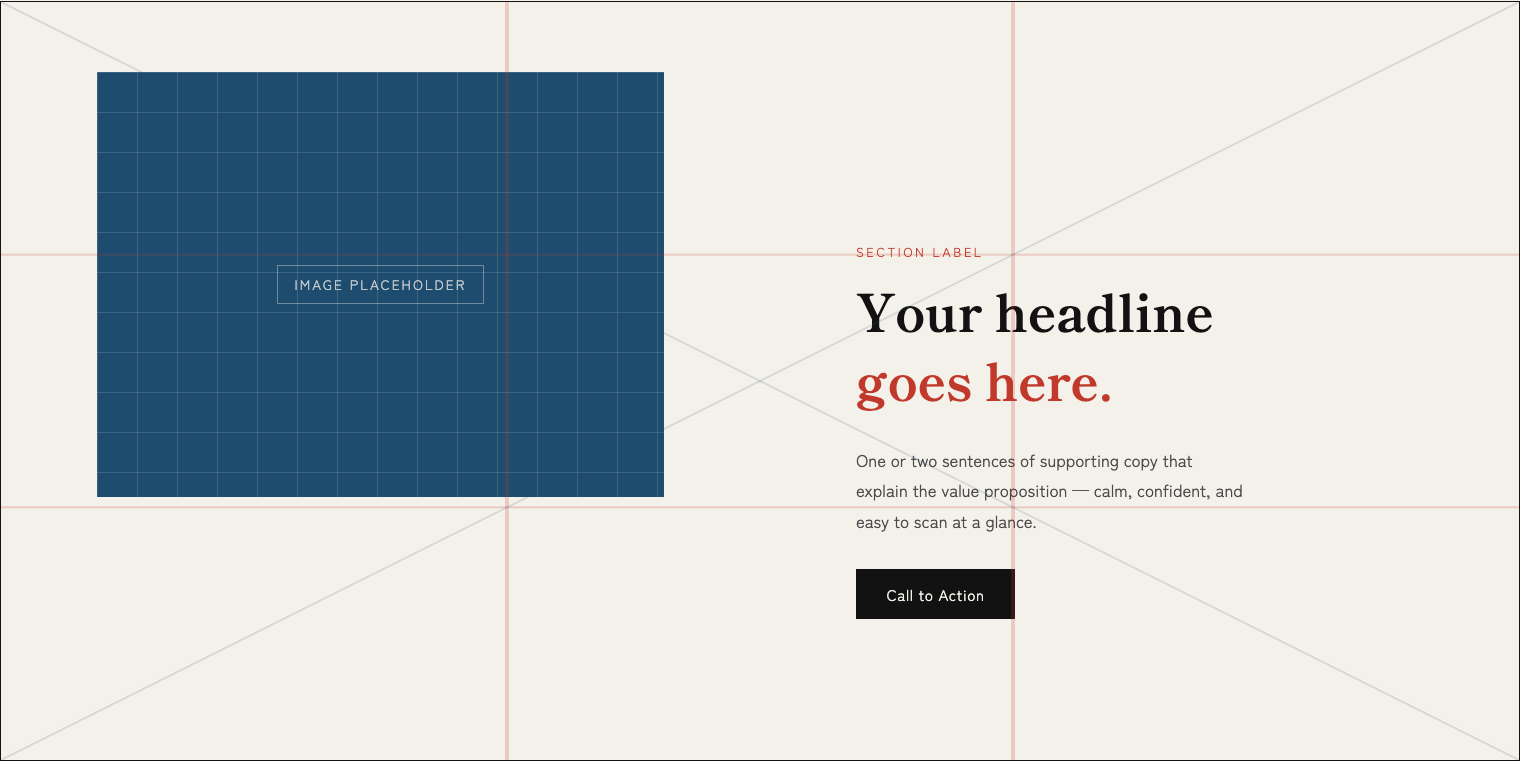
That shift is what makes the after version feel like it's moving, and the before version feel like it's just sitting there — the same visual momentum the wave's diagonal gives the painting, borrowed for a browser window.
None of this means your headline needs to sit at a mathematically exact coordinate. Screens come in a thousand sizes, and a grid that lines up on a 1440px desktop becomes something else entirely on a 375px phone. What survives across every viewport isn't the coordinate — it's the awareness.
On a phone, there's no room for two columns side by side — but there's still a grid, just a taller one. In the after version, the image is deliberately resized, both narrower and shorter, and pushed to the right, instead of stretched full-width the way a default mobile hero usually renders it. That's not an arbitrary shrink — its new corner lands on the same grid intersection the wave's crest sits on, keeping it on the same diagonal axis the image and headline share on desktop, instead of collapsing into two centered blocks stacked flatly on top of each other.


Nothing was added, on either screen. Same two boxes, same copy, same image — only their relationship to each other changed. That's the whole trick, and it's the entire argument of this piece: composition isn't decoration layered on top of a layout. It is the layout.
None of this makes the diagonal the correct answer, either. Dynamism isn't always the goal — plenty of strong hero sections stay calm and centered on purpose. What matters isn't landing on the diagonal specifically. It's asking the question at all: where does the eye enter, where does it rest, and does the relationship between those two points say anything on purpose.
6. Close
A grid drawn over a painting after the fact doesn't prove much on its own. What makes this different is that Hokusai left the method in his own hand, more than two hundred years before "first view" was a phrase anyone needed.
You don't need a new hero image, a new headline, or a new anything. Draw the three-by-three on what you already have. Draw the diagonal. If your two most important elements aren't sitting near an intersection, move them until they are — that's the whole fix, and it costs nothing but attention.