
At a glance, Hokusai's blue looks like a single blue. But indigo shifts in hue as it deepens, and that movement gives it depth. Let's bring it into a screen palette.
1. The hook
Let's take The Great Wave off Kanagawa and pull out only the blue.
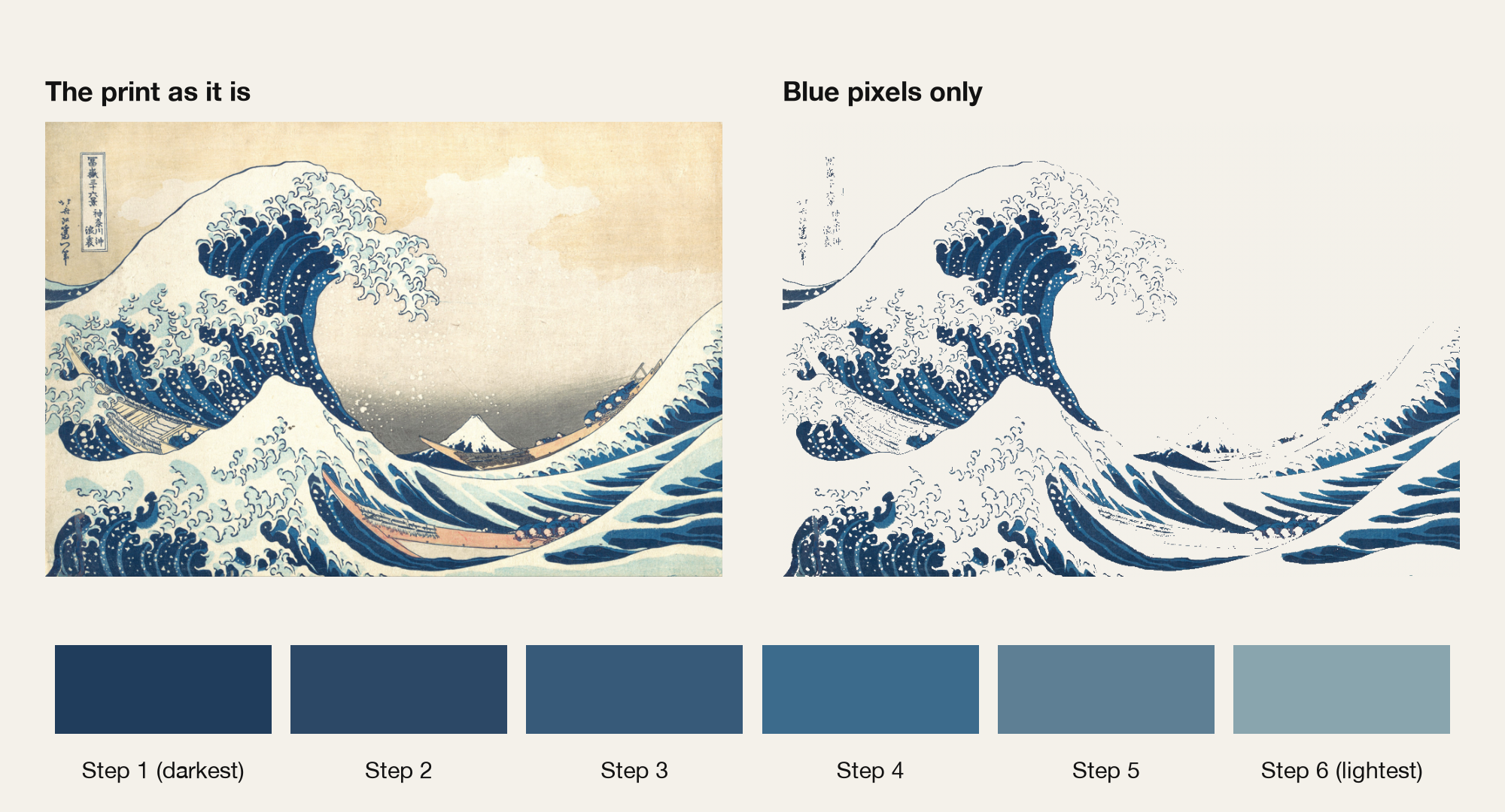 Based on: Katsushika Hokusai, The Great Wave off Kanagawac. 1830–32. The Metropolitan Museum of Art (Public Domain)
Remove the color of the paper, the pale tone of the boats, and the white of the foam, and what remains is blue in different depths. At a glance, it looks like one blue in many shades.
But look closely at the six steps, and the hue seems to drift a little as well as the lightness. It looks like one blue, yet it isn't flat. Where does that depth come from?
This piece is an attempt to bring that movement of hue into a screen palette.
2. What Hokusai Blue is
Hokusai's blue has long been called "Hokusai Blue" abroad. It is a synthetic pigment that was found by accident in Europe in the early 18th century. In Japan it was called bero-ai ("Berlin indigo"), and today we know it as Prussian blue.
In ukiyo-e, it began to appear around 1830, and within a few years most prints used this blue. Thirty-Six Views of Mount Fuji is the series that symbolizes that changeover.
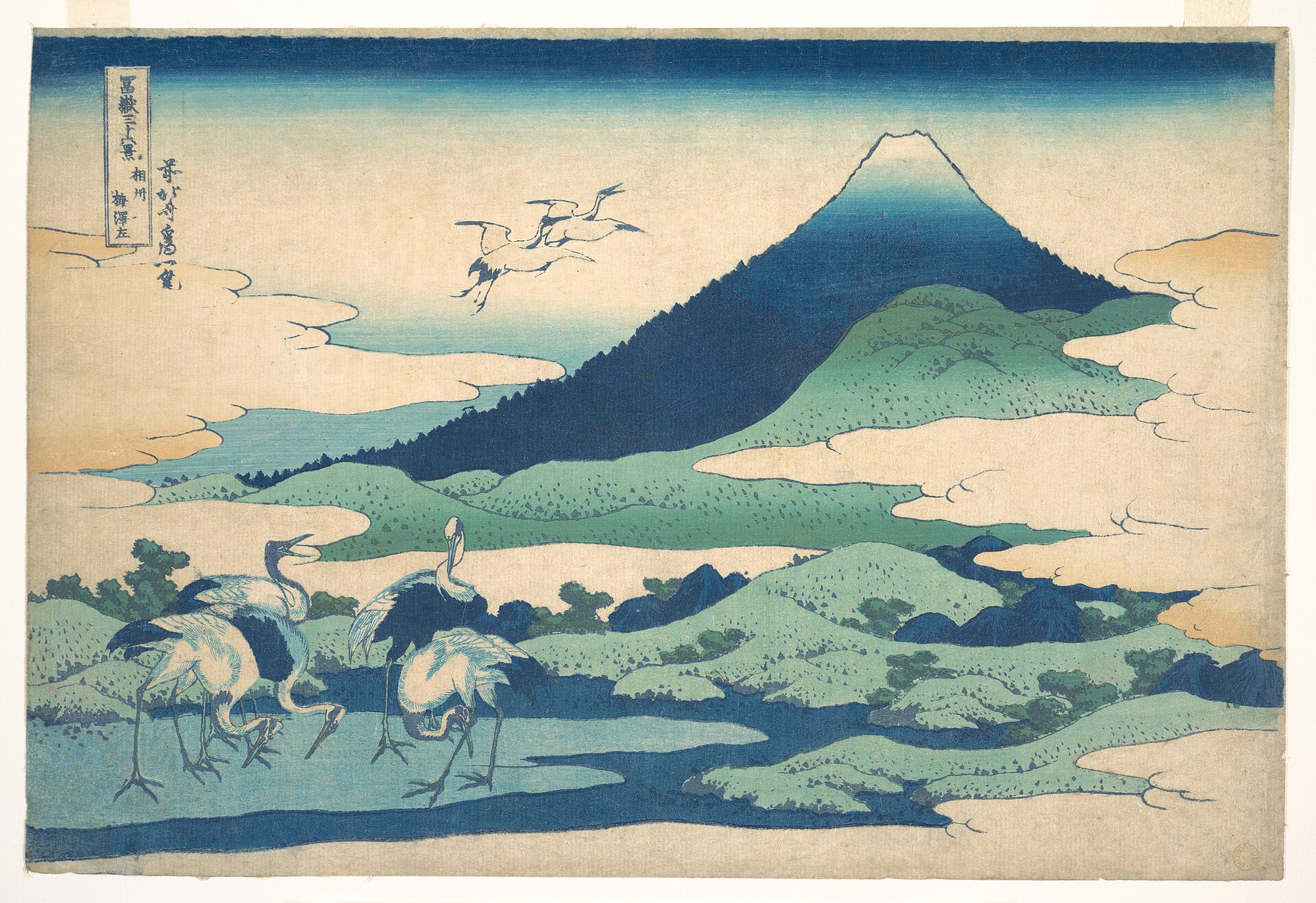 Katsushika Hokusai, Umezawa Manor in Sagami Provincefrom Thirty-Six Views of Mount Fuji, c. 1830–32. The Metropolitan Museum of Art (CC0)
3. What was new about Prussian blue
Earlier blues faded easily, were hard to handle, or were expensive, which made them hard to use freely in prints. Prussian blue was vivid, resistant to fading, and affordable.
It is also made of extremely fine particles that disperse well in water. Particles that settle into the gaps between paper fibers look deep where they cluster, and pale where they spread out. The same pigment changes its depth depending on how its particles are distributed. That property is said to have suited bokashi, the printing technique where blue fades smoothly from dark to light.
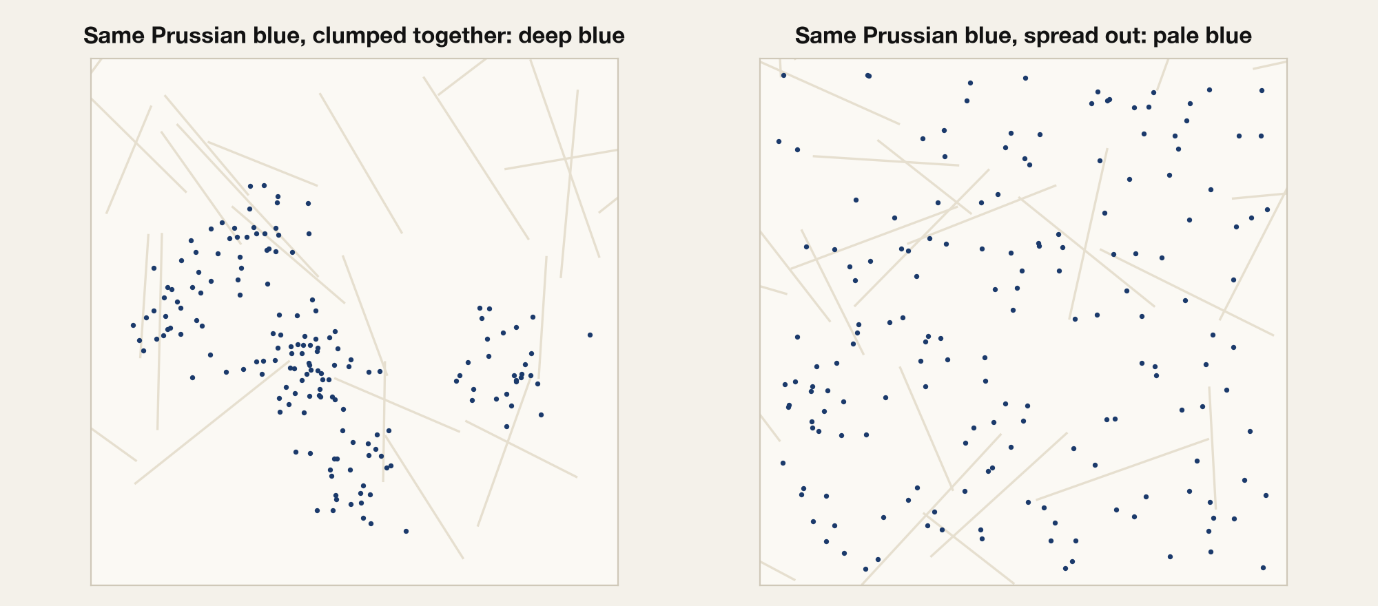
In other words, Prussian blue was a material that let printers make depth of color smoothly, almost at will. In the next section, we look at how Japan had already been making depth of indigo. That is where the subject of this piece lies.
4. A Japanese kata: making depth in steps
If Prussian blue is a material that makes depth smoothly, Japan already had a tradition of making depth in steps. Indigo dyeing works by dipping cloth into the vat again and again. The number and length of the dips became the names of the colors.
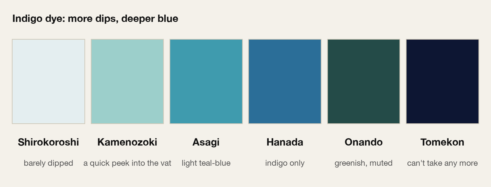
The palest, shirokoroshi, is cloth dipped so lightly that it "kills the white." Kamenozoki is said to be cloth dipped just briefly, as if peeking into the vat. The deepest, tomekon, is the point where the cloth can take no more. Hear the name and you can picture how it was dyed: a kata in which the name tells you how it's made, like the ones we saw in the layered colors of the Heian court. (The origins of these names are debated.)
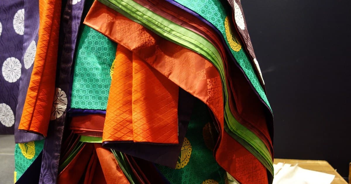
Kata for Web Designers, No. 2
Color Isn't Chosen, It's Layered: Designing Translucent Color from the Kasane Palettes
We usually pick colors one at a time. Heian court ladies designed the color that appears when two layers overlap. Let's see what that idea looks like on screen.
Line up those color names, though, and something stands out. The depth of indigo changes not only in lightness, but in hue. And it doesn't move in one direction.
The pale shades, kamenozoki and asagi, lean toward a greenish light blue. Hanada, in the middle, is plain blue dyed with indigo alone. Then onando, the next step, goes back to a greenish, dark, muted color. And tomekon, the deepest, turns into a navy with a touch of red. Indigo is said to take on more red as it deepens, and some accounts say Japanese indigo was originally greenish. (The colors here are approximations picked by eye from a book's swatches. Please read them as a rough tendency.)
In short, as indigo deepens, its hue goes back and forth, from greenish, to blue, to a reddish navy. It looks like one family of indigo, yet it isn't monotonous. That complex movement gives indigo its depth.
Printmaking is where this way of making depth met the smoothness of Prussian blue. The first ten prints of Thirty-Six Views of Mount Fuji are said to have been printed in blue shades alone, a style called aizuri-e.
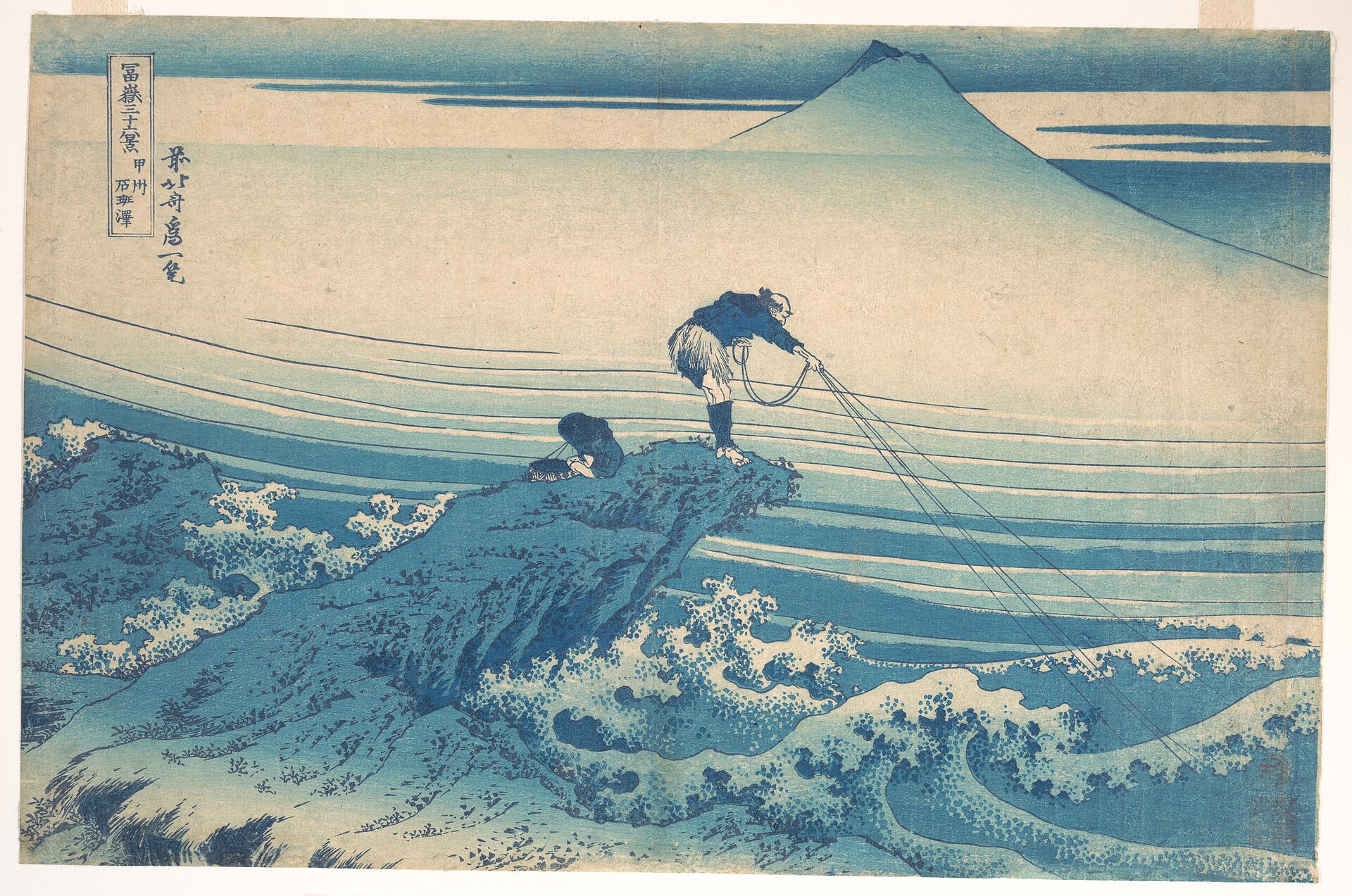 Katsushika Hokusai, Kajikazawa in Kai Provincefrom Thirty-Six Views of Mount Fuji, c. 1830–32. The Metropolitan Museum of Art (CC0)
A scientific study of The Great Wave has suggested that two kinds of blue, indigo and Prussian blue, were layered together. Both are blues in the same family, so to the eye they read as shades of one blue.
5. How the blue is actually arranged in the print
So far, that is what has been said about this blue. Prussian blue is often described as good at expressing depth through shading. But how is the blue actually used in the picture?
Let's look at the actual print.
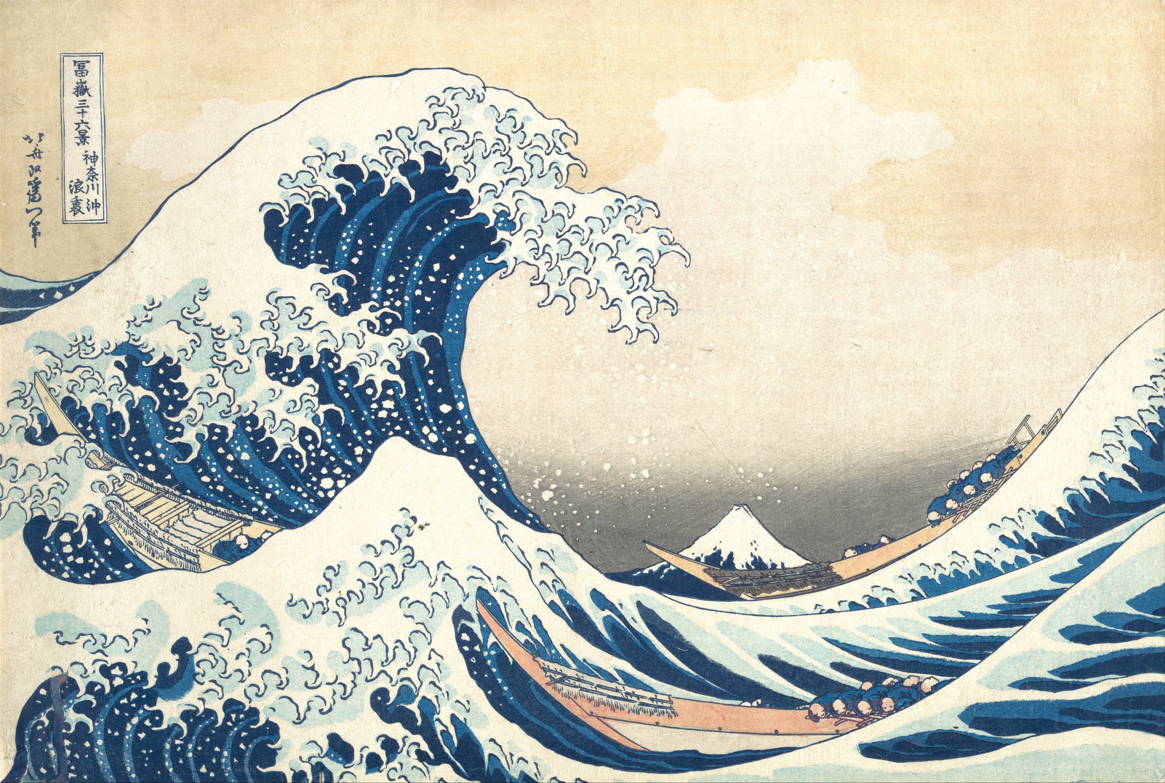 Katsushika Hokusai, The Great Wave off Kanagawac. 1830–32. The Metropolitan Museum of Art (Public Domain)
I extracted only the blue pixels from images of The Great Wave, sorted them into six steps by lightness, and lined them up from dark to light. The number of steps was chosen for readability; the print itself doesn't have "six steps." I did the same with four publicly available images of different impressions (A to D, sources noted in the figure).
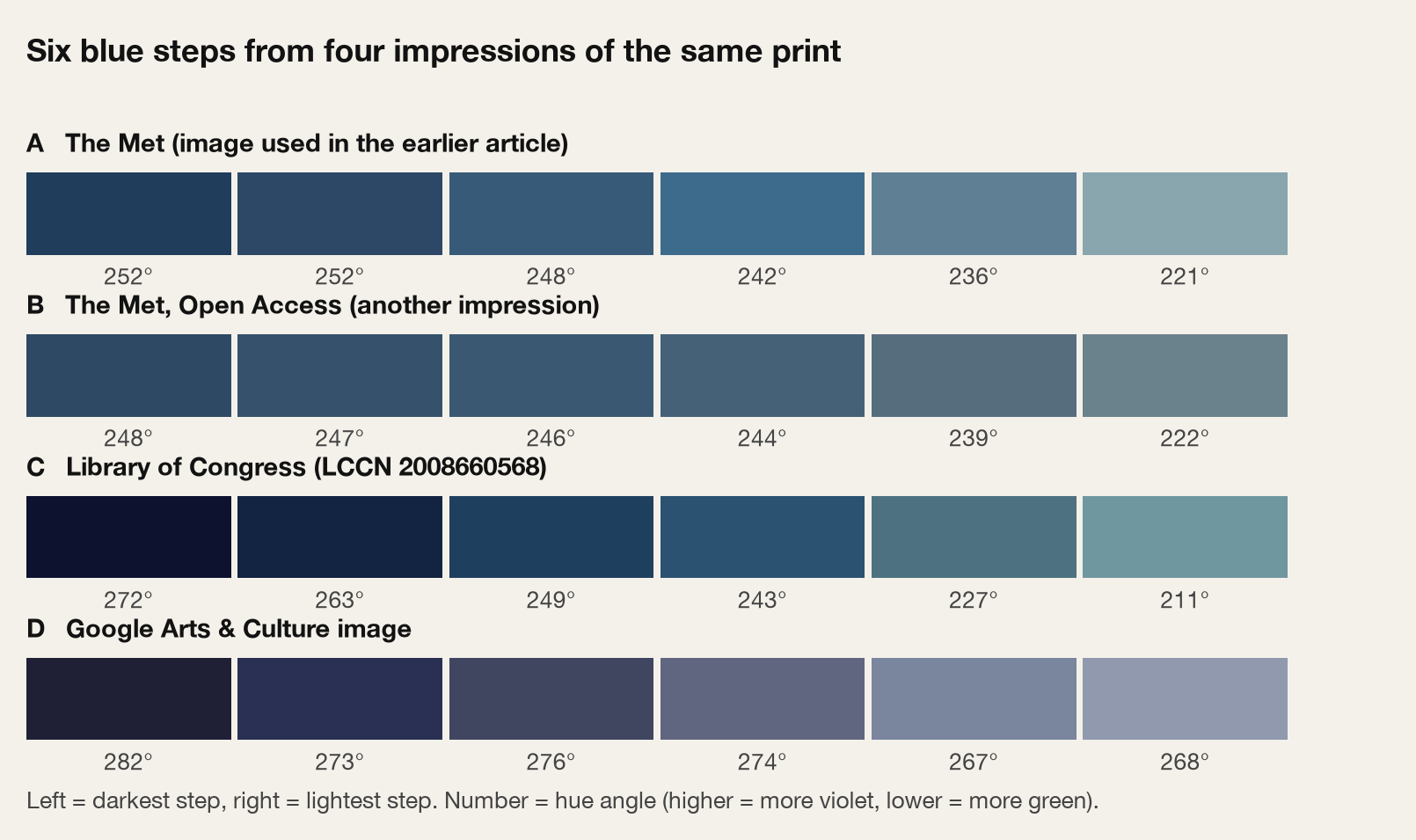 Colors taken from four impressions of The Great Wave off Kanagawa(sources: The Met; Library of Congress; Google Arts & Culture)
Three things come into view. This is not a rigorous measurement; please take them as tendencies you can see.
First, the darker blues look slightly violet, and the lighter blues look slightly closer to light blue. All four images lean the same way. But paper yellowing may be mixed in, and a rough correction for the paper color cut the difference roughly in half. It's a hint, not a rule. Still, it's interesting that the direction matches the account that indigo takes on more red as it deepens.
Second, shading seems to be used for the form of the waves rather than for distance. The blue around distant Mount Fuji and the blue of the waves up front are about equally deep, so it isn't a simple "farther is paler." Dark and pale blues move back and forth to build the ridges and shadows of the waves.
Third, the colors themselves differ a lot between impressions. Aging and photography account for it, so there is no "correct value" for Hokusai Blue. That is why this piece shows no values from the print and borrows only the relationships.
What we borrow from here is a trait of indigo: it looks like one blue, but its hue moves with depth. What we see in the print is only a hint that points the same way as the arrangement of indigo dye colors.
6. Translating it to the web: a tonal scale that looks like one blue but shifts in hue
From here, we bring that trait of indigo into a screen palette.
A print and a screen are different things. The indigo color names are about dyeing; screen colors are made by calculation. So here we translate the trait "it looks like one blue, yet its hue moves with depth" into rules for a scale.
First, the plain single-hue scale
In web palettes, a "single-hue scale" is common: one hue held fixed while only lightness changes in steps.

Here I used OKLCH, a lightness scale close to how people see, and made 11 steps from 50 to 950.
This is a standard method that also echoes Western monochrome painting. But with the hue fixed, the light end looks chalky and the deep end looks nearly black, so it can feel a little flat.
Copying the arrangement of indigo
So I turned the movement of indigo into three rules.
- Light steps lean toward a greenish light blue, like pale indigo (kamenozoki, asagi).
- Deep steps lean toward a reddish violet, like deep indigo (tomekon).
- Deep steps also get a little more chroma, so the color looks richer as it deepens.
With the base blue at 252°, the hue moves gradually from about 192° at the light end to about 312° at the deep end. The light side leans toward a greenish light blue; the deep side leans from blue-violet to a deep navy. Shifting the hue alone is hard to see on the deep side, so I also raised chroma by about 1.8 times.
This takes only the tendencies at both ends of indigo's complex movement and simplifies them into one direction. The back-and-forth, like onando, is left out so the scale is easy to use on screen.

Compare it with the plain scale
First, the scales alone, stacked vertically. The top is the plain single-hue scale (A), the bottom is the scale that copies indigo (B). The same number is the same lightness.
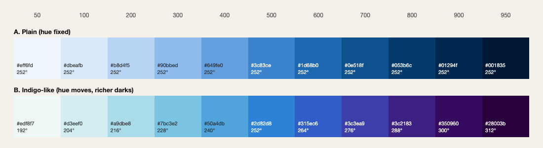
A is a plain blue in shades. B moves from the base blue at 500: toward a greenish light blue on the light side, and toward blue-violet and deep violet on the deep side.
Next, let's apply the same scales to a screen UI. On the left is a light screen, on the right a dark screen.
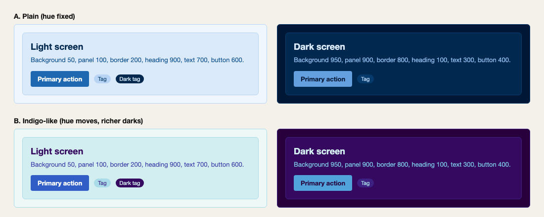
The roles are assigned identically, yet A feels cool and tight while B feels deep and calm. Both look like the same family of blue, but B has more depth and expression. (How it feels will vary from person to person.)
One caution: shift the hue too far, or raise chroma too much, and it leaves the feel of indigo and starts to read as a scale of different colors, from light blue to magenta. The values here are pushed a little on purpose so the difference is visible. They are a design of my own, inspired by the order of indigo-dye colors, not an accurate reproduction of indigo.
Give each step a role
Once the scale exists, assign each step a role: background 50, panel 100, border 200, button 600, heading 900, and so on. The difference in lightness between surfaces becomes the structure of the screen. Without adding colors, you can still read what is background and what is the main actor.
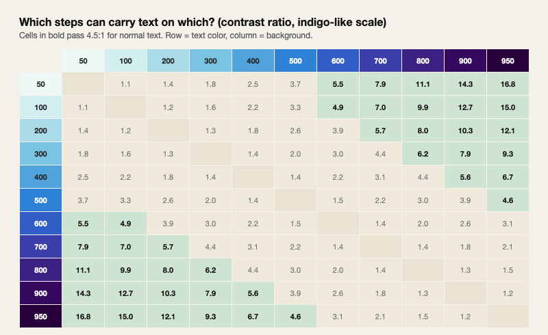
Check the contrast
Whether text is readable depends on which two steps you pair. In this example, any pair six steps apart exceeded the 4.5 standard. Five steps apart also passed, except 50 on 500.
Dip it again
Finally, like dyeing, let's add one dip at a time and watch how the color advances. On the left is the hue-fixed scale; on the right, the scale that copies indigo.
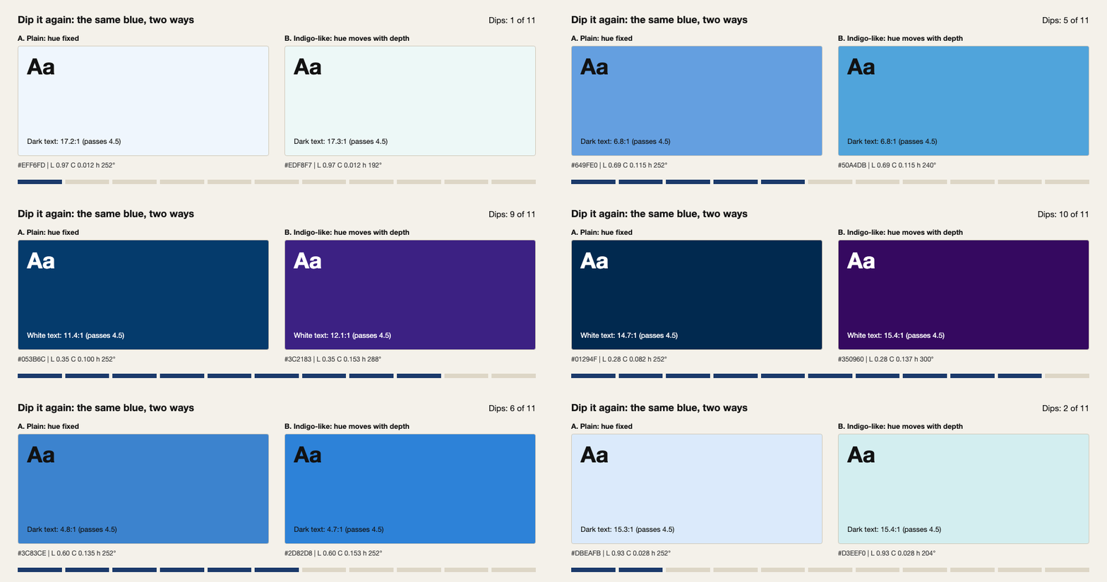
With the same number of dips, the right side moves from a greenish light blue toward violet as it goes.
Try it: ready to use
This part is a tool for actual use. Below is the scale that copies indigo, the starting values for this piece. Paste it into your CSS and it works.
:root {
  --hokusai-50: #edf8f7;
  --hokusai-100: #d3eef0;
  --hokusai-200: #a9dbe8;
  --hokusai-300: #7bc3e2;
  --hokusai-400: #50a4db;
  --hokusai-500: #2d82d8;
  --hokusai-600: #315ec6;
  --hokusai-700: #3c3ea9;
  --hokusai-800: #3c2183;
  --hokusai-900: #350960;
  --hokusai-950: #28003b;
}
Assign the roles like this.
body   { background: var(--hokusai-50);  color: var(--hokusai-700); }
.card  { background: var(--hokusai-100); border: 1px solid var(--hokusai-200); }
h1, h2 { color: var(--hokusai-900); }
.button { background: var(--hokusai-600); color: #fff; }
For dark mode, use the same scale from the other end.
@media (prefers-color-scheme: dark) {
  body   { background: var(--hokusai-950); color: var(--hokusai-300); }
  .card  { background: var(--hokusai-900); border-color: var(--hokusai-800); }
  h1, h2 { color: var(--hokusai-100); }
  .button { background: var(--hokusai-400); color: var(--hokusai-950); }
}
Every text pairing here has a contrast ratio of 4.5 or higher (for these starting values).
These values are not the exact colors of Hokusai Blue. They are a starting point I designed for this piece. Feel free to use the code and the color codes as you like, commercial work included, no credit needed.
Use the generator below to make colors for your own site. Set "Hue shift" to 0 and you get the plain single-hue scale (A). Move the hue shift and "Richer darks" to see how the depth of indigo appears. You can also use other base hues. Click a color to copy its code, or use the export button to copy the whole scale. The preview switches between light and dark and checks contrast for each role automatically. Choose "Roles (light + dark)" in the export to copy CSS that supports dark mode as it is.
Try it: build your own scale
Click a swatch to copy its color code
Preview
One scale, every role
The same scale plays every role: background, panel, border, text, heading, button.
Primary actionRole contrast
- Text on background7.9:1 OK
- Text on panel7.0:1 OK
- Heading on panel12.7:1 OK
- Button label5.9:1 OK
Contrast check
Passes 4.5:1 (normal text)
Export
:root {
  --hokusai-50: #edf8f7;
  --hokusai-100: #d3eef0;
  --hokusai-200: #a9dbe8;
  --hokusai-300: #7bc3e2;
  --hokusai-400: #50a4db;
  --hokusai-500: #2d82d8;
  --hokusai-600: #315ec6;
  --hokusai-700: #3c3ea9;
  --hokusai-800: #3c2183;
  --hokusai-900: #350960;
  --hokusai-950: #28003b;
}
Free to use, commercial work included. No credit needed.
Of course, you don't need to use it everywhere. Build the foundation with this scale, and place a different color only where it matters most. Then that one spot comes alive.
7. Close
At a glance, Hokusai's blue looks like one blue. But the depth of indigo changes not only in lightness but in hue, and that gives it its richness.
The next time you work on color for a screen, it's worth asking how deeply you can use a single blue before you add another color. Greener on the light side, more violet on the deep side. Move the hue just a little, and one family of blue gives you more expressions than you might expect.
Reference
- 戸田吉彦『北斎のデザイン 冨嶽三十六景から北斎漫画までデザイン視点で読み解く北斎の至宝』(Yoshihiko Toda, The Design of Hokusai, in Japanese)
- 福田邦夫『すぐわかる日本の伝統色 改訂版』(Kunio Fukuda, Sugu wakaru Nihon no dentō-shoku, revised edition, in Japanese)
- 魚田昌美『歴史とともに楽しむ 日本の美しい色 古代からたどる287の伝統色』(Masami Uota, Rekishi to tomo ni tanoshimu Nihon no utsukushii iro, in Japanese)
- Katsuaki Sato, "Hokusai Blue through materials science" (a public lecture, 2018, in Japanese)
- The Metropolitan Museum of Art, "Hokusai's Great Wave"