
We usually pick colors one at a time. Heian court ladies designed the color that appears when two layers overlap. Let's see what that idea looks like on screen.
1. The hook
Here are two pieces of cloth.
One is white. The other is a deep red.
Lay the white cloth over the red one.
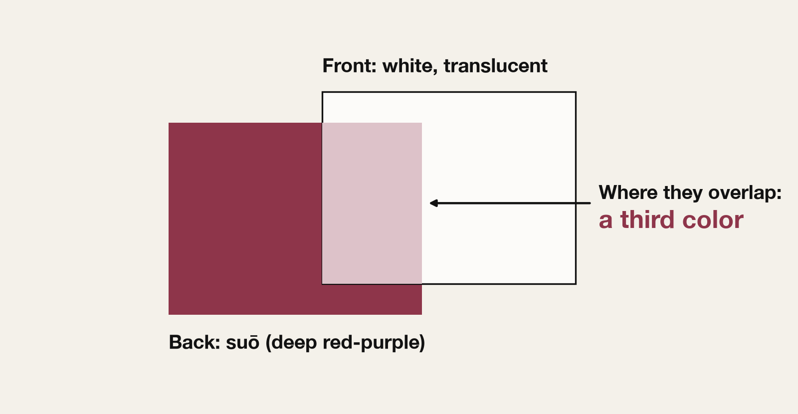
Where they overlap, what appears is neither white nor red, but a pale cherry pink. We chose only two colors, yet what the eye sees is a third.
2. What kasane no irome is
In the Heian period (794–1185), the women of the imperial court wore what is now called jūnihitoe, "twelve layers." In practice it meant many layers of thin silk robes worn one over another, with a set of five (the itsutsuginu) as the standard.
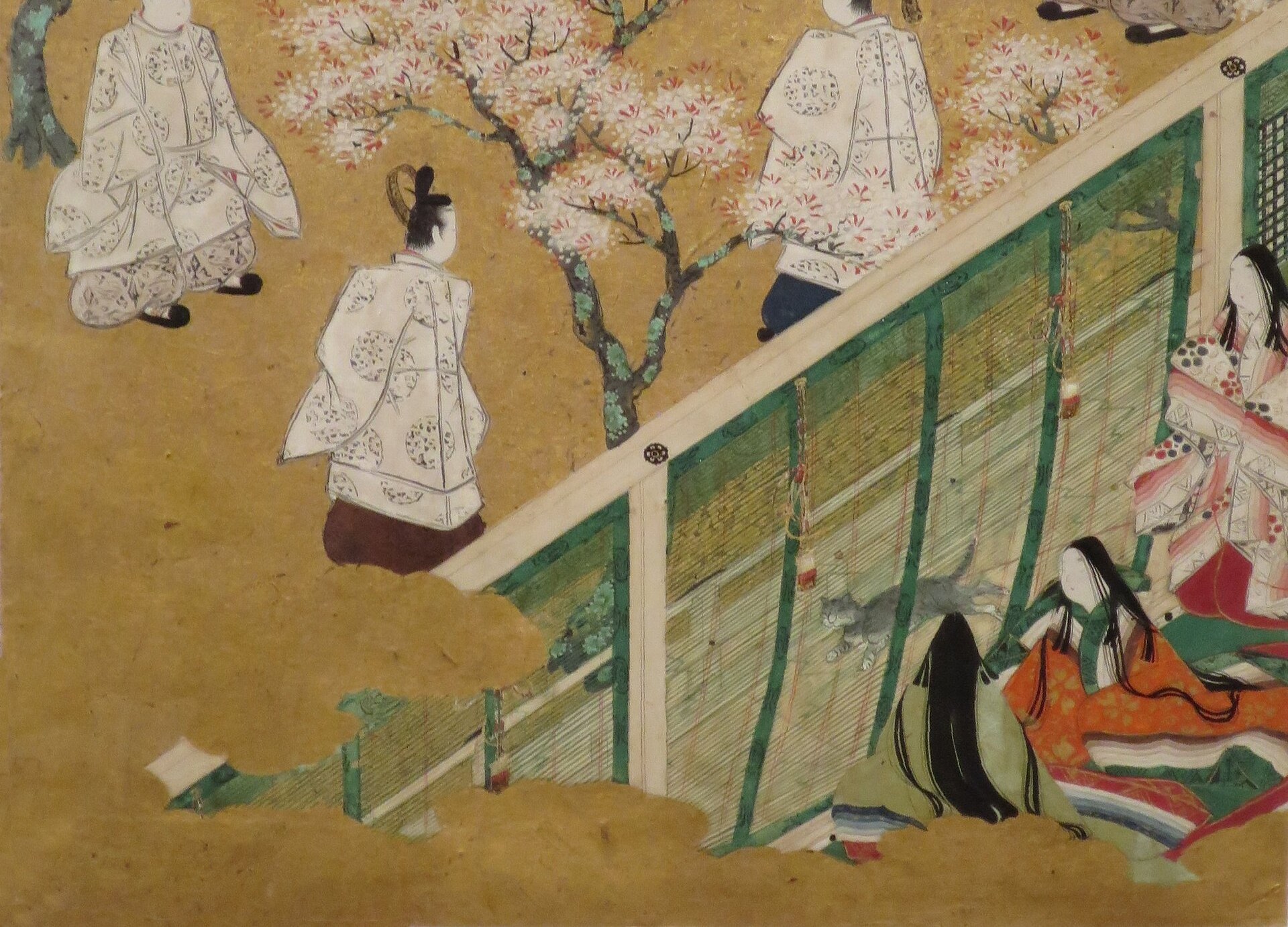
Not every layer is visible. What shows is only the edge: the collar, the sleeve opening, the hem. Along those edges, many colors line up as thin bands.
Each of these layered combinations had a name. Ume (plum), sakura (cherry), fuji (wisteria), unohana (deutzia), momiji (autumn leaves), yuki-no-shita (beneath the snow): the names come from seasonal plants and scenes. A combination like this is called a kasane no irome, roughly "the colors of the layers."
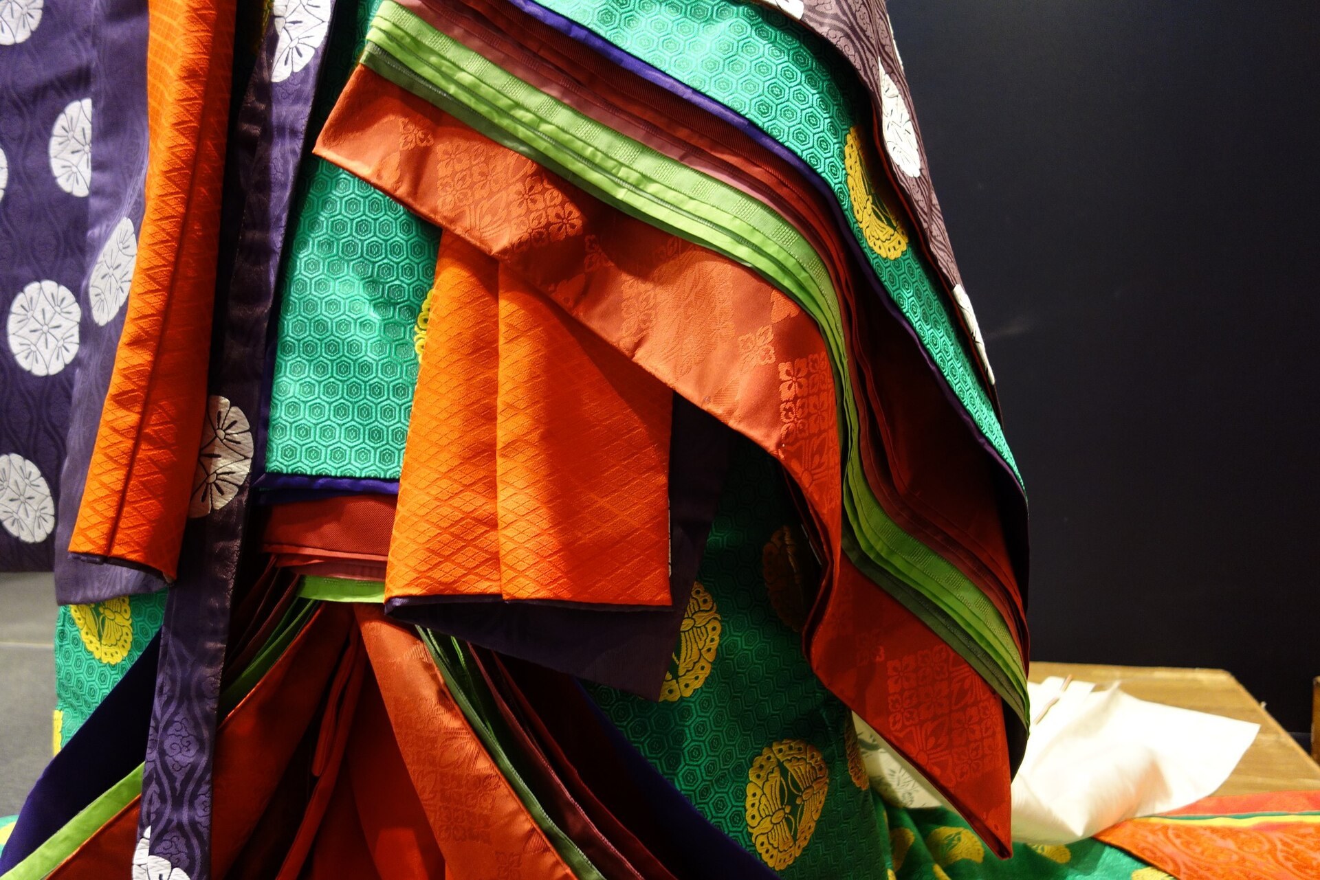
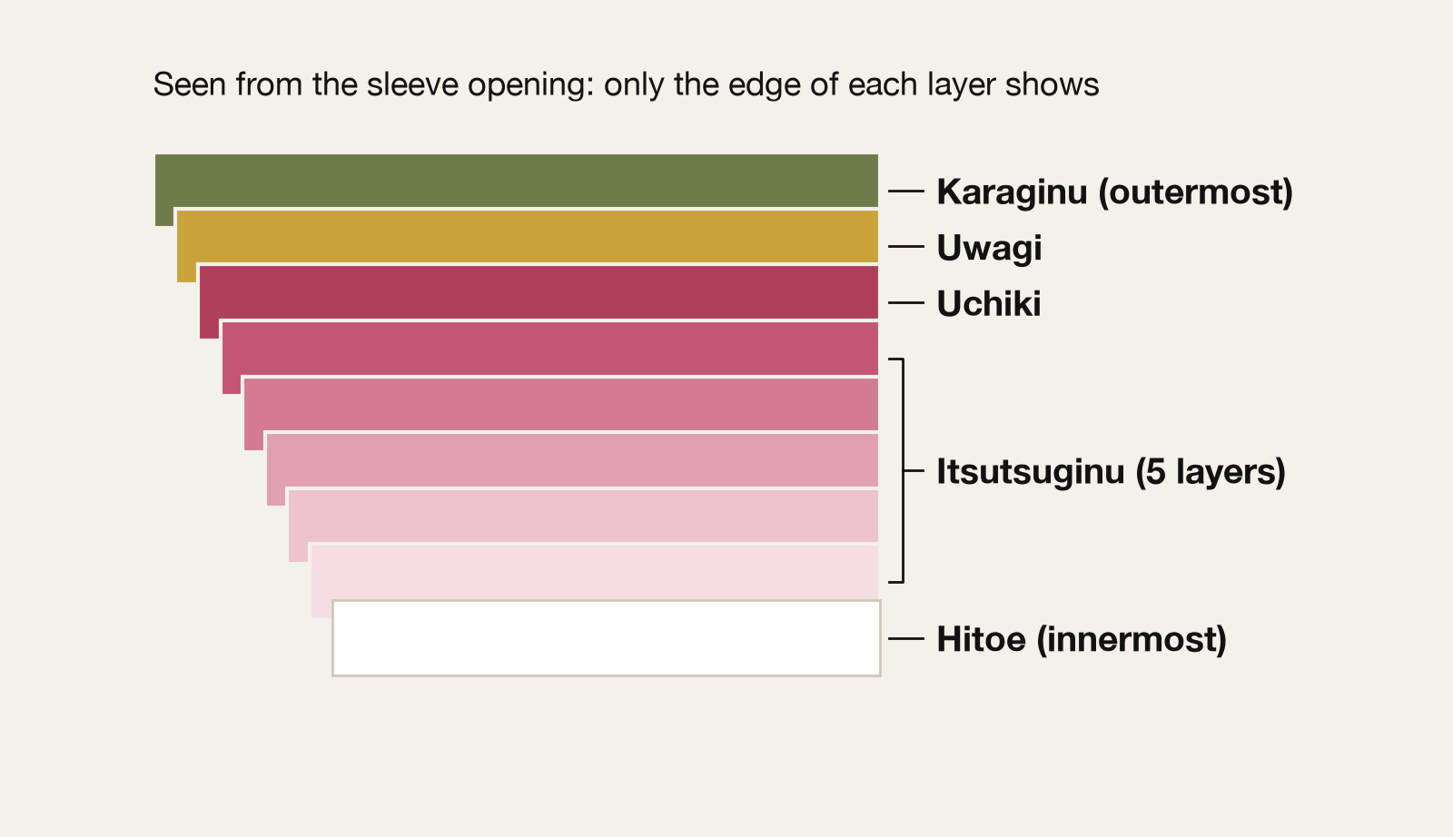
The term kasane no irome itself is a later one, but the combinations and their names were already in use in the Heian period.
3. Shrinking nature into two colors
The plants these names refer to weren't copied as they are. One reading holds that the natural scene was reduced to as few colors as possible and then written down symbolically.
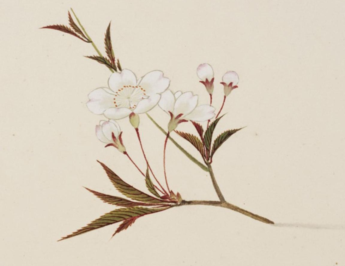
Take the sakura combination. Its outer layer is white, and its inner layer is a red or purplish tone. A mountain cherry opens white flowers just as its reddish young leaves come out. Read this way, the combination shrinks that scene into two colors: white and red. (This is one commentator's interpretation, not something with firm evidence behind it.)
There were also rules about which combination to wear and when. Each season had its own set, and sometimes the set also depended on age. It looks like freedom of choice, but in practice the wearer's taste showed in how she chose within the rules.
Court women had few chances to be seen. One book describes how letting only the hem of a carefully coordinated outfit peek out from under the edge of a bamboo blind (misu) was a way to show one's sensibility and education. Not all of it, just the edge: that was how the colors were used.
4. The kata has names, and there isn't one right answer
Some kasane names carry a technique inside them.
A name with nioi in it, for example, means a gradient of one color, arranged from dark to light. A name with kasane means every layer is dyed the same color. And there are combinations like murago, a gradient between two colors. Hearing the name was enough to guess how the combination was built.
Yet even for the same name, which color goes on the outside and which on the inside differs by source.
Kakitsubata (iris), for instance, is given in one book as ai-violet outside and fresh green inside, and in another as pale green outside and pale plum-pink inside. Hagi (bush clover) has a pale purple lining in one book and a white one in another.
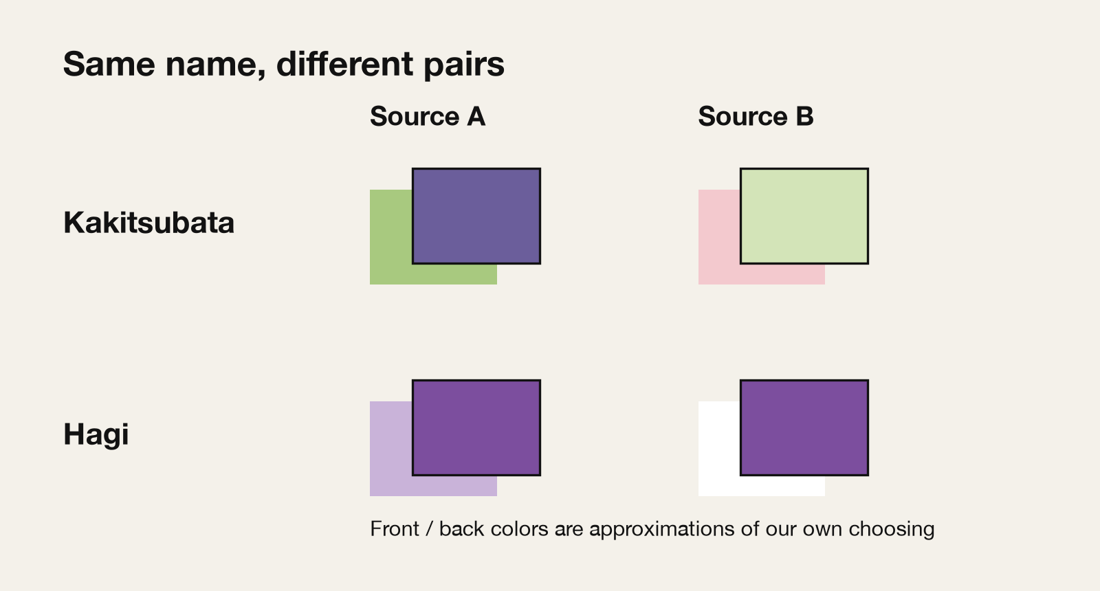
Neither book hides this. Both say up front that the combinations are matters of debate (shosetsu). The combinations are thought to have shifted from manuscript to manuscript as time went on.
So kasane no irome was never a table with one fixed answer. The names and the idea of technique behind them were shared, and the details varied by source and by school. That is the shape of this kata.
5. Don't choose colors, design the color that appears
Seen this way, kasane no irome is less a technique for choosing colors than a technique for layering them.
Choosing the outer color and the inner color doesn't yet decide what the eye will see. How thin the outer cloth is, how much the inner color shows through: the third color appears as the result of that overlap. What a kasane combination designs is the color you see after layering.
When we think about color for the web, on the other hand, we usually choose one color at a time: brand color, background, accent. We pick from a palette and line things up. Designing the color that results from layering, in advance, is not a common way of thinking.
From here on, we try to reproduce this idea on screen.
One caveat: silk and screens work differently. Silk's translucency is light passing through cloth, while what a screen does is a calculation that blends two colors. They aren't the same phenomenon. Still, the idea of layering two colors to design a third can be reproduced on screen.
6. Translating it to the web: designing the layered result
In CSS, a color can have opacity. Make the front color slightly transparent and lay it over a back color, and a blend of the two appears.
Take white and suō. Suō is a traditional color close to a deep red-purple. This pairing was given, in nearly the same way, as a plum combination in more than one of the sources we compared. Let the white in front be slightly transparent over the suō, and you get a pale, plum-blossom-like color.
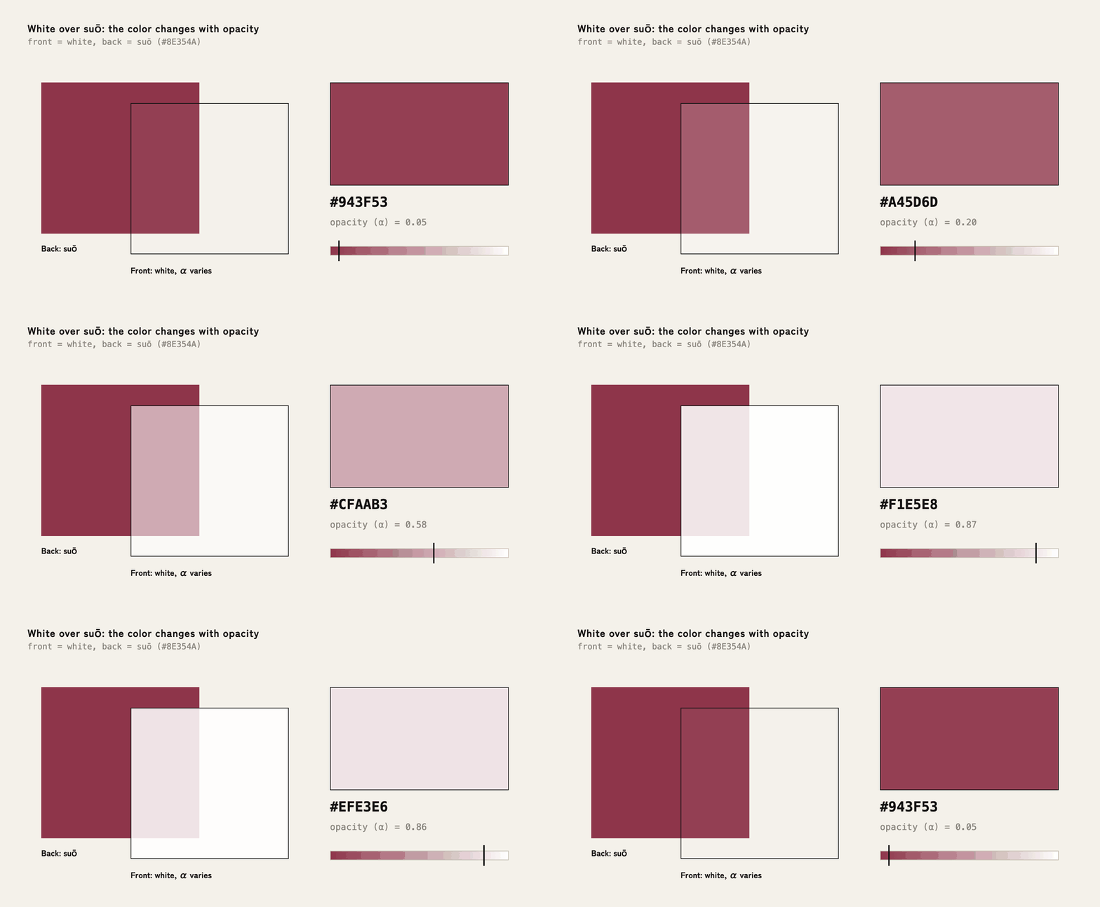
The color values used here are not official values for traditional colors; they are approximations of our own choosing.
What to look for in the demo is that changing only the opacity gives a range of colors from one pair. We chose just two: white and suō.
There's one more thing that matters: whether text placed on the layered color can be read.
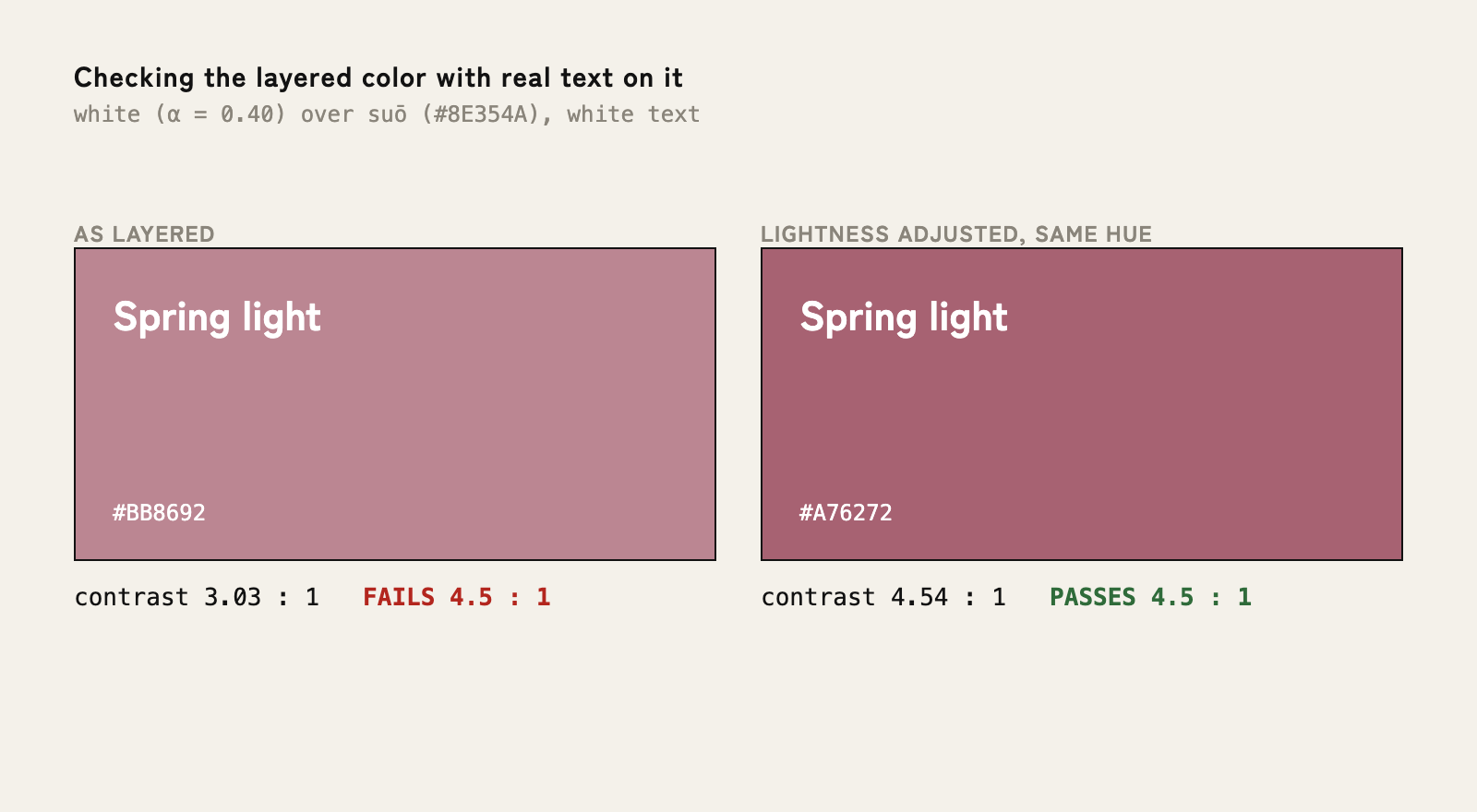
In this example, white text on the color layered at 0.4 opacity has a contrast ratio of about 3.0, short of the 4.5 standard. Lower only the lightness a little, keeping the hue, and it rises to about 4.5, which makes it readable.
On screen, how beautiful it looks isn't enough; the text has to be readable too. Measure the contrast ratio between the composited color and the text, and when it falls short, adjust only the lightness and keep the hue. Keep the kata, and check readability as well: that's how kasane works on screen.
Of course, not everything needs to be layered and translucent. Save layered color for the one place where it counts, and that one place will feel alive.
7. Close
Kasane no irome was a technique for choosing colors, and at the same time a technique for designing the color that appears when they overlap.
The next time you're working on color for a screen, it's worth going beyond picking from a palette one color at a time, and designing what two layered colors produce, together. A third color emerges from the two you chose. Looking at that room widens the choices a little.
Reference
- 福田邦夫『すぐわかる日本の伝統色 改訂版』(Kunio Fukuda, Sugu wakaru Nihon no dentō-shoku, revised edition, in Japanese)
- 魚田昌美『歴史とともに楽しむ 日本の美しい色 古代からたどる287の伝統色』(Masami Uota, Rekishi to tomo ni tanoshimu Nihon no utsukushii iro, in Japanese)