
The same wireframe can carry two completely different moods. Hokusai proved it two centuries ago — with the same mountain, painted twice.
1. The hook
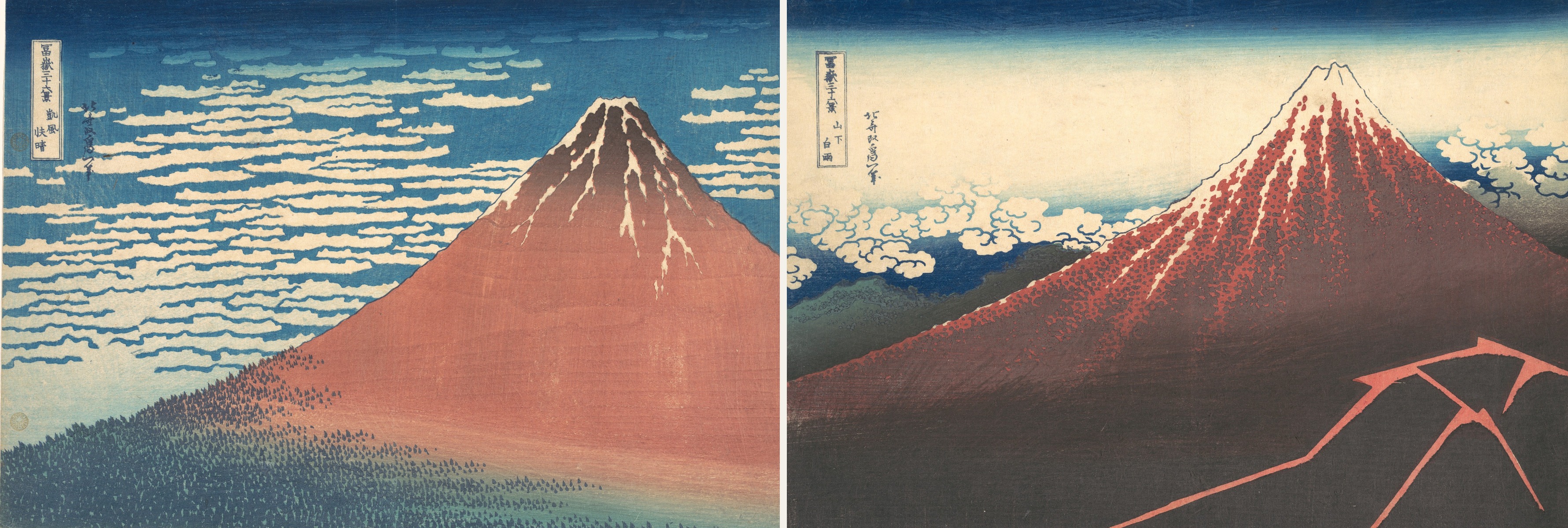
Here are two paintings, side by side.
Hokusai's Gaifū Kaisei (Red Fuji) and Sanka Hakuu (Black Fuji). The mountain's shape is nearly identical in both — the same rising ridgeline from base to peak, the same clean summit. And yet one reads as bright and calm, the other as uneasy and unsettled.
The elements are almost the same. The impression is the exact opposite. What changed?
The wireframe can stay the same while a site's emotion is designed independently. That's what this piece is about.
2. Last time, briefly
Last time we looked at The Great Wave off Kanagawa and saw how Mitsuwari no Hō — the method of three-part division — designs the order the eye travels in.
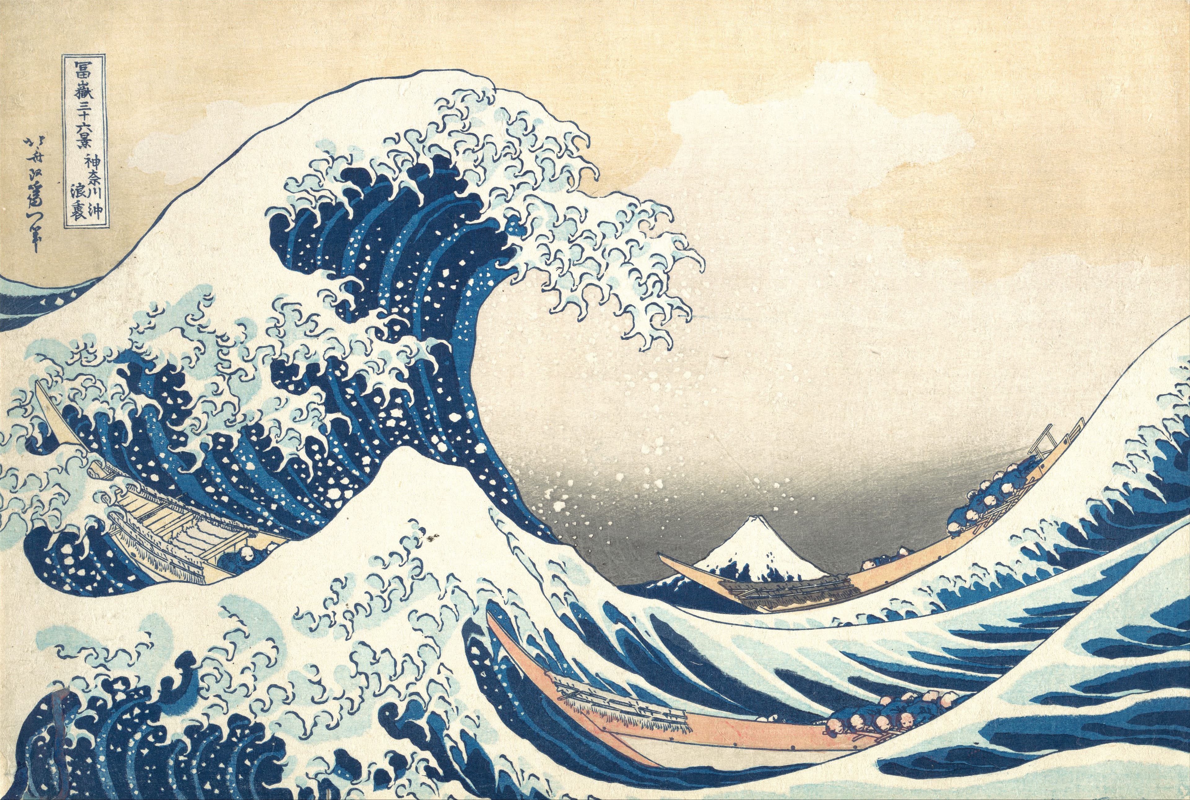
Hokusai for Web Designers, No. 1
The Great Wave Is a Wireframe: Hokusai's Grid for Guiding the Eye
Two centuries before 'above the fold' had a name, Hokusai had already worked out exactly where your eye should land — and in what order.
Along with Red Fuji and Black Fuji, that print is one of the "san'yaku" — the three most celebrated prints in the Thirty-Six Views of Mount Fuji. Last time was about the order the eye moves in. This time the eye still moves, but the question isn't order — it's what the journey makes you feel.
3. Red Fuji: what's inside the bands makes the mountain climb
Same as last time, let's cut Red Fuji with Mitsuwari no Hō — the horizontal three-part division.
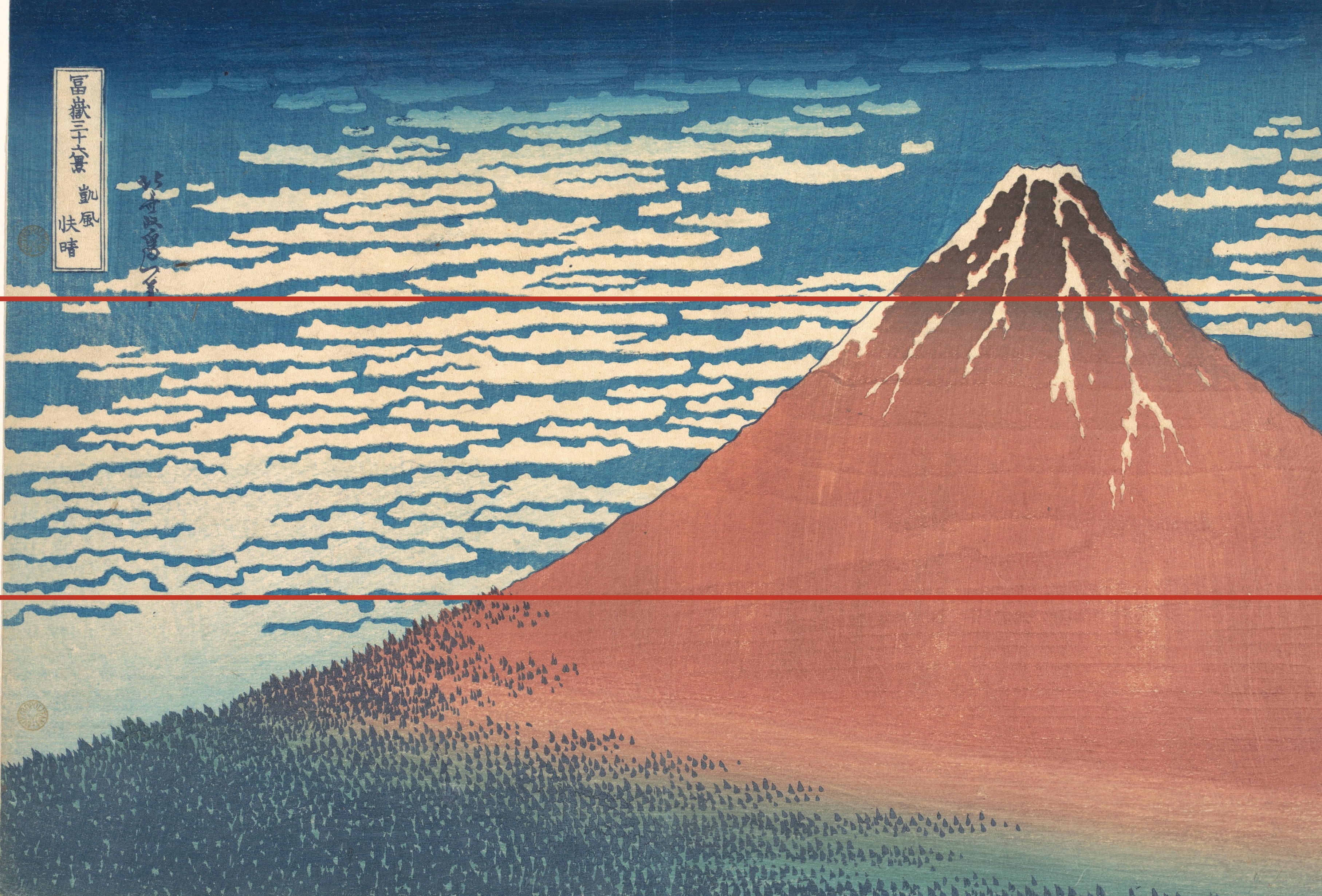
As you can see, Fuji is pushed hard to the right, its right slope cropped clean off the edge of the frame. Fuji had usually been painted with both ridgelines showing, set inside its surroundings. Hokusai moves it hard right instead, keeps only the left ridge, and cuts the right slope and everything around it out of frame entirely. Freed from having to fit both slopes in, Fuji ends up filling nearly half the frame as one unbroken, confident plane of color.
That plane isn't painted carelessly, though. Measure the thirds lines against it and the tip of the forest (the dense stand of conifers) lands almost exactly on the lower line. Above that is the red flank of the mountain; above that, the peak with its streaks of remaining snow — base, body, and summit, mapped almost exactly onto the three bands.
I read this as deliberate — Hokusai dividing his color by hand, on purpose. I can't prove it, but the boundaries land on the lines too cleanly to be coincidence.
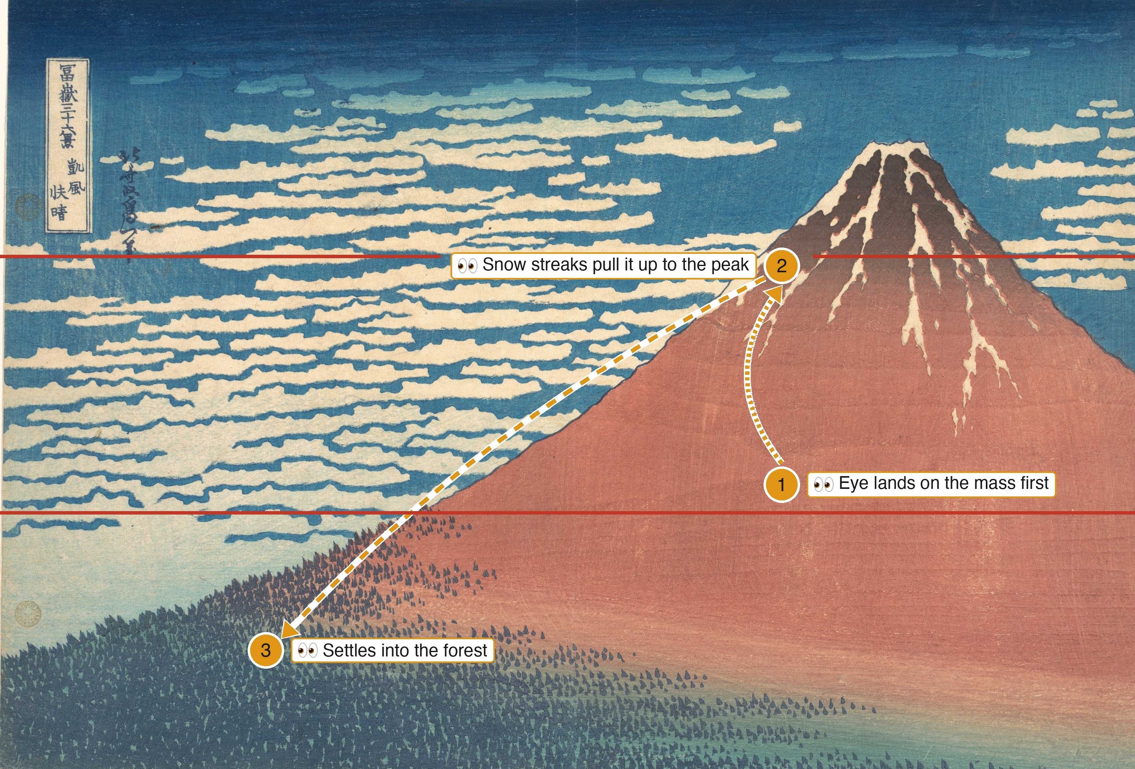
Looking at the print itself, your eye goes first to the warm triangle that fills most of the frame. Inside it, the white streaks of snow pull the eye upward, climbing naturally to the peak. By the time it drifts left and settles into the green of the forest base, there's real mass sitting at the bottom of the frame — a feeling of having climbed and arrived, of settling after the climb rather than merely looking up.
4. Black Fuji: what's inside the bands drops the eye
Let's cut Black Fuji with the same method.
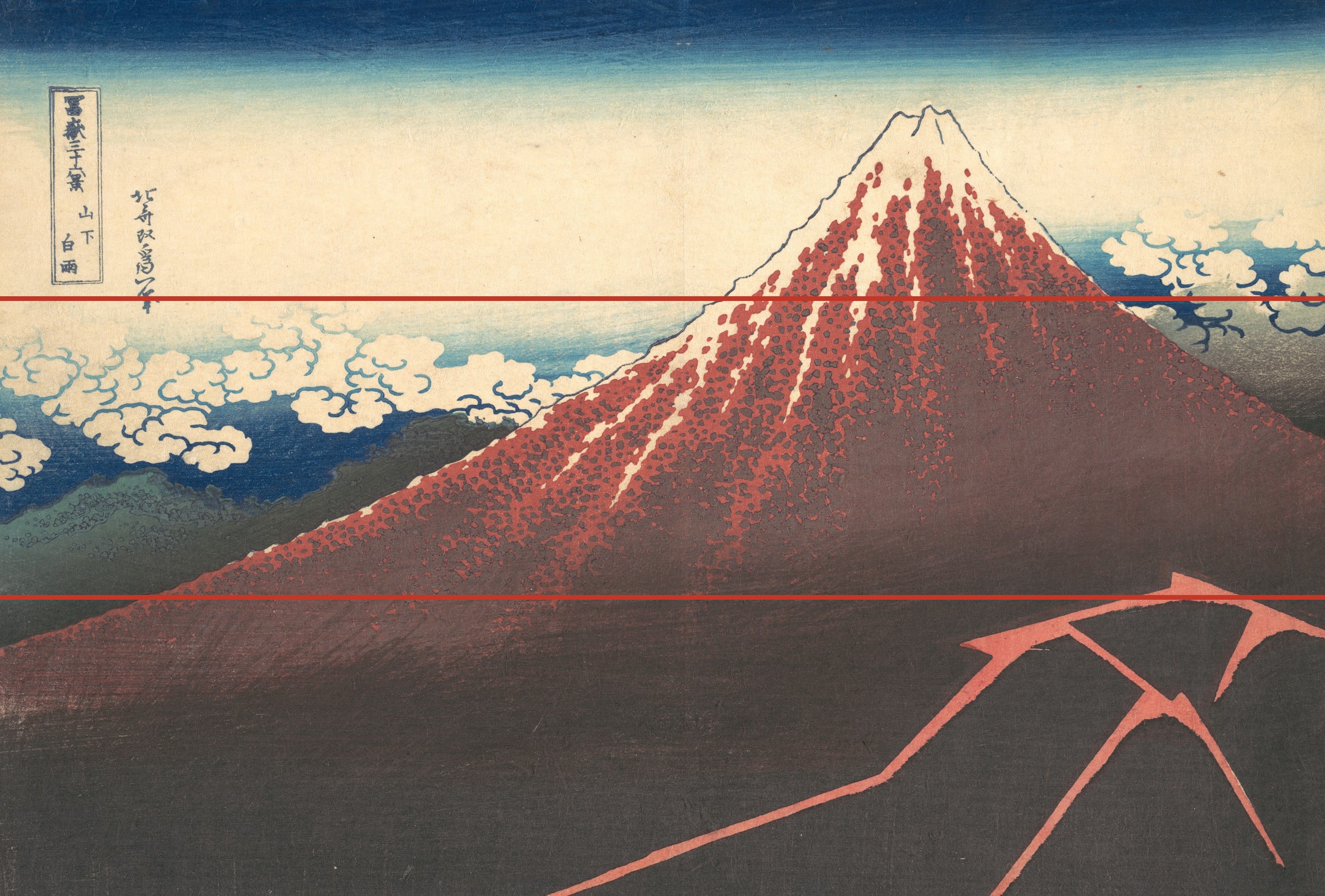
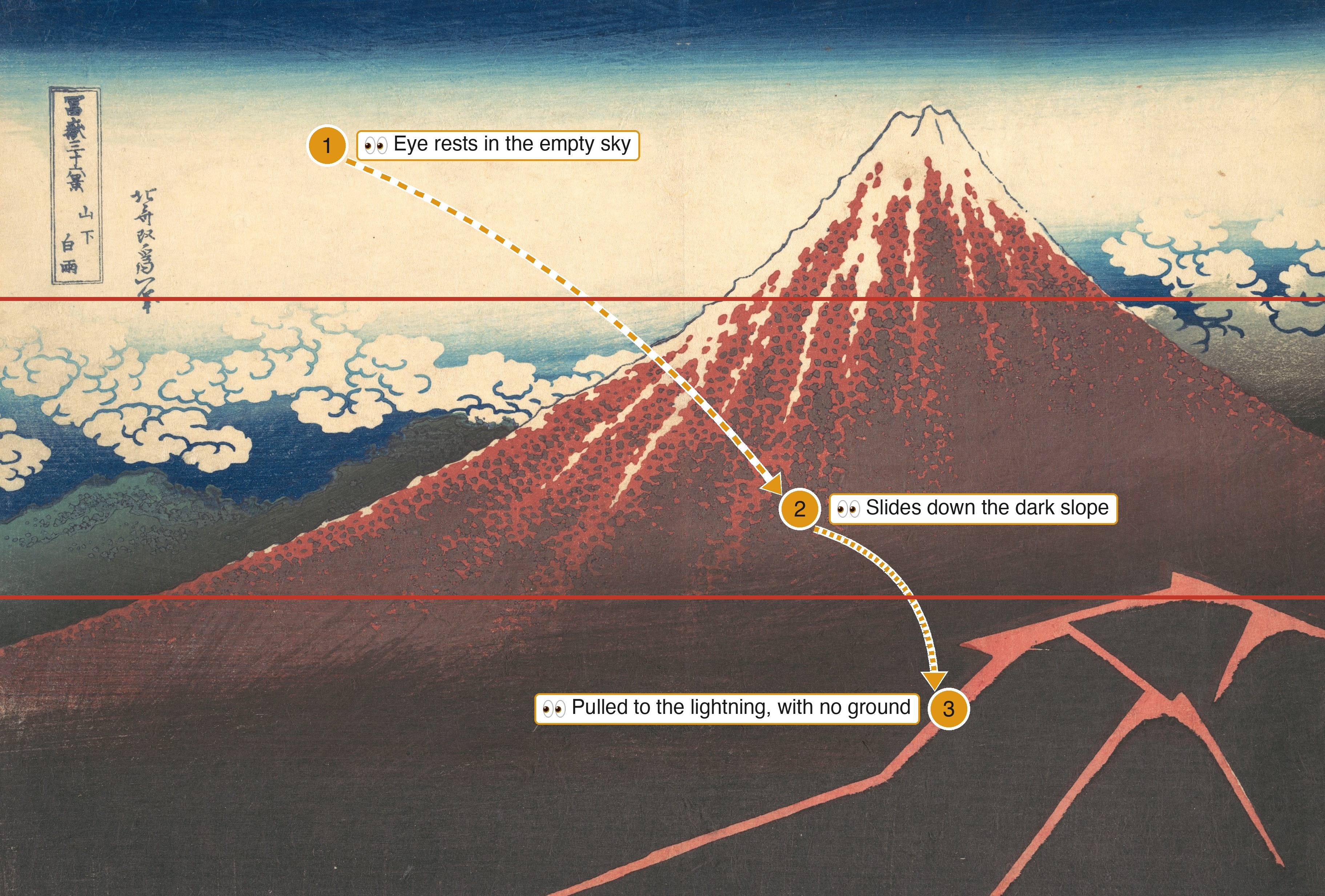
Below the lower line, the frame turns almost completely black. Where Red Fuji had a living green at that exact height, Black Fuji has nothing but empty dark — and inside that dark, a single bolt of lightning, alone, in the lower right.
Above the upper line is a sparse, cream-colored sky, barely any cloud in it — about as empty as Red Fuji's sky is dense.
When I look at this print, my eye actually lands first in that empty upper-left sky. It's the part of the frame carrying the least information, so the eye catches there for a beat. From there it traces down the dark slope and gets pulled to the one thing with any saturation in an otherwise black field: the lightning. Small as it is, that's what makes it grab more attention than its size should allow. And because there's no ground drawn in where the eye settles, it leaves an unresolved, unsteady feeling — falling, with nowhere to land.
If Red Fuji is a composition that looks up and lands, Black Fuji looks down and hangs in the air.
5. What actually changed the emotion
| Red Fuji | Black Fuji | |
|---|---|---|
| What's in the bands | Green (life) → red → snow | Black (void) → red → cream |
| Eye movement | Climbs, lands on mass | Falls, hangs over nothing |
| Viewpoint | Looking up | Looking down |
| Impression | Bright, stable | Anxious, tense |
What they share: both use the thirds boundary as a meaningful break in content, not just a compositional guide. What's happening clearly changes above and below the line — Red Fuji puts it at the join between forest and mountain body, Black Fuji at the join between mountain and void. The difference is what's placed inside each band, and which direction the eye is sent.
6. Applying it to web design: same hero, two emotions
Same as last time, let's build two hero sections from the same three elements — image, headline, button. Nothing added.
A: Red Fuji type (bright, stable)
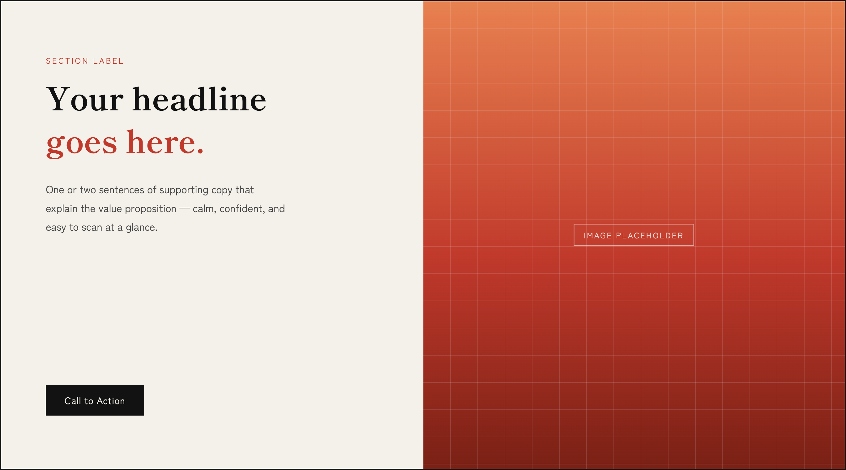
- Push the lead image to one side and bleed it off the edge
- Let a near-solid, bright field of color fill a large, unbroken area
- Keep the headline and button together in the quiet area outside that field
Desktop
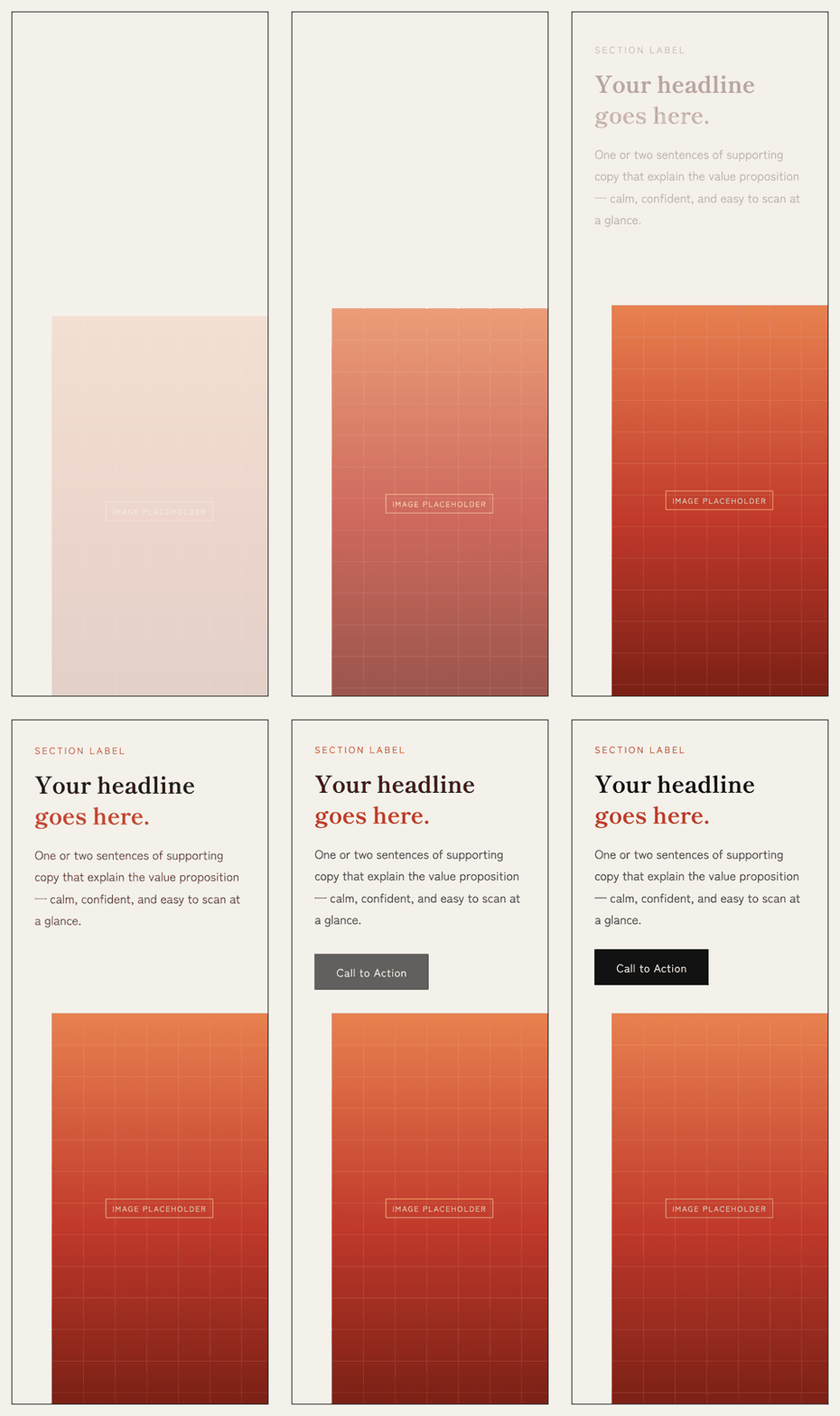
Mobile
On desktop, the image's visual weight and the button's landing point sit at the same height. By the time the headline has caught up and the button settles quietly into place, the layout alone has reproduced the painting's "climb, then land" feeling.
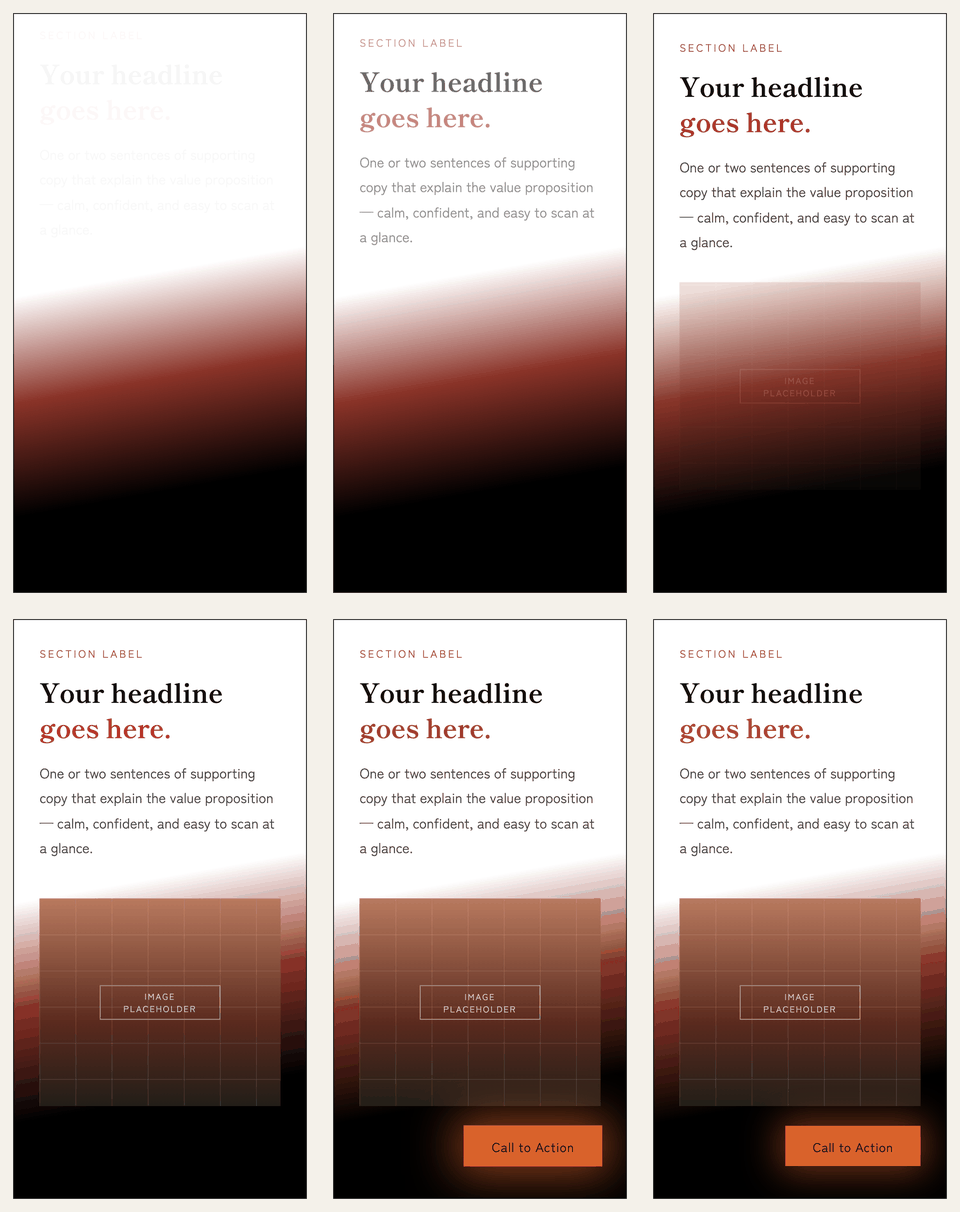
Mobile only has one column, so the same trick doesn't work. The layout order is text → button → image (get the message across first, on a phone) — but the reveal order is image → headline → button, fading in gently. That's the "climbing" eye movement the layout can't express, recovered on the timeline instead.
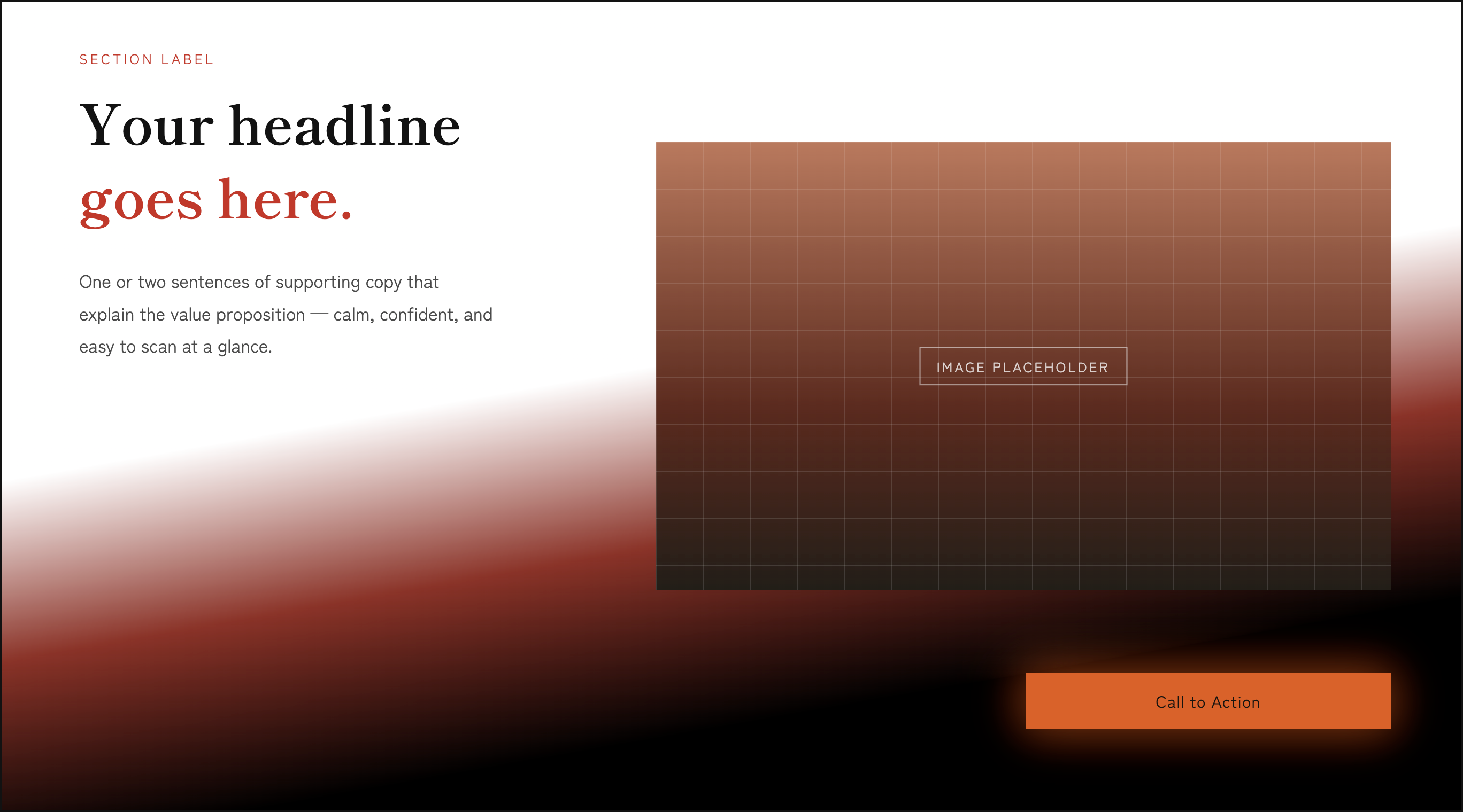
B: Black Fuji type (heavy, tense)
- Same wireframe as A — text and visual sit side by side
- Cover the whole section in one continuous gradient, white → rust-red → black
- Isolate the one bright element (the button) alone in empty darkness, at the spot where the lightning actually falls in the painting (lower right)
Normally a CTA sits right under the body copy. In B, it's deliberately pulled away — placed at the very end of the eye's path, past the image, alone in the dark. The button not being where you'd expect it is itself part of what makes this feel unsettled, adrift.
Desktop
Mobile
On desktop, B does the opposite: it leaves a wide stretch of empty darkness around the button instead. Where A gives the eye somewhere to land, B deliberately withholds it — which is exactly what produces the "falls, with nowhere to land" feeling.
B's mobile layout differs from A's, too: only the text stays up top; the image and button are bundled together and sent to the bottom (though like A, the text that states the value proposition still comes first). The reveal follows that same layout order (text → image → button) rather than reordering it — but it differs from A in two ways. One is tempo: the whole sequence runs faster than A's, trading ease for urgency. The other is texture: the button doesn't fade in — it snaps in suddenly, like a lightning strike. Changing both speed and texture together is what builds the sense of falling tension.
Neither is the "correct" answer. A healthcare or education site might want A's reassurance; a film, a mystery, or a brand built on heaviness might want B's tension. What matters isn't which one you pick — it's that you decide on purpose, instead of leaving the impression to chance.
7. Close: three moves, not a set of numbers
Hokusai's compositions come with plenty of precise ratios, but you don't need to memorize any of them to use this. Three moves are enough.
- Line up any boundary where color or value changes sharply with a grid division
- Decide which direction the eye should travel by what you put in each band — density, saturation
- Place one bright element alone inside a dark band, and it will grab more attention than its size alone would earn
Hokusai built two different emotions out of the same mountain using nothing but color, viewpoint, and how he allotted empty space. To try it on your own hero section, two moves are enough:
- Compare the impression you get putting the darkest band versus the brightest band at the bottom of the frame
- Track where your own eye lands first, and where it goes next
Nothing needs to be added.
Reference
- 戸田吉彦『北斎のデザイン 冨嶽三十六景から北斎漫画までデザイン視点で読み解く北斎の至宝』(Yoshihiko Toda, The Design of Hokusai, in Japanese)