
We tend to think of a curve as roundness. The defining curve of traditional Japanese design is something else: a dip, then a rise — a shape that turns out to be a movement in time.
1. The hook
Here's a curve worth a second look.
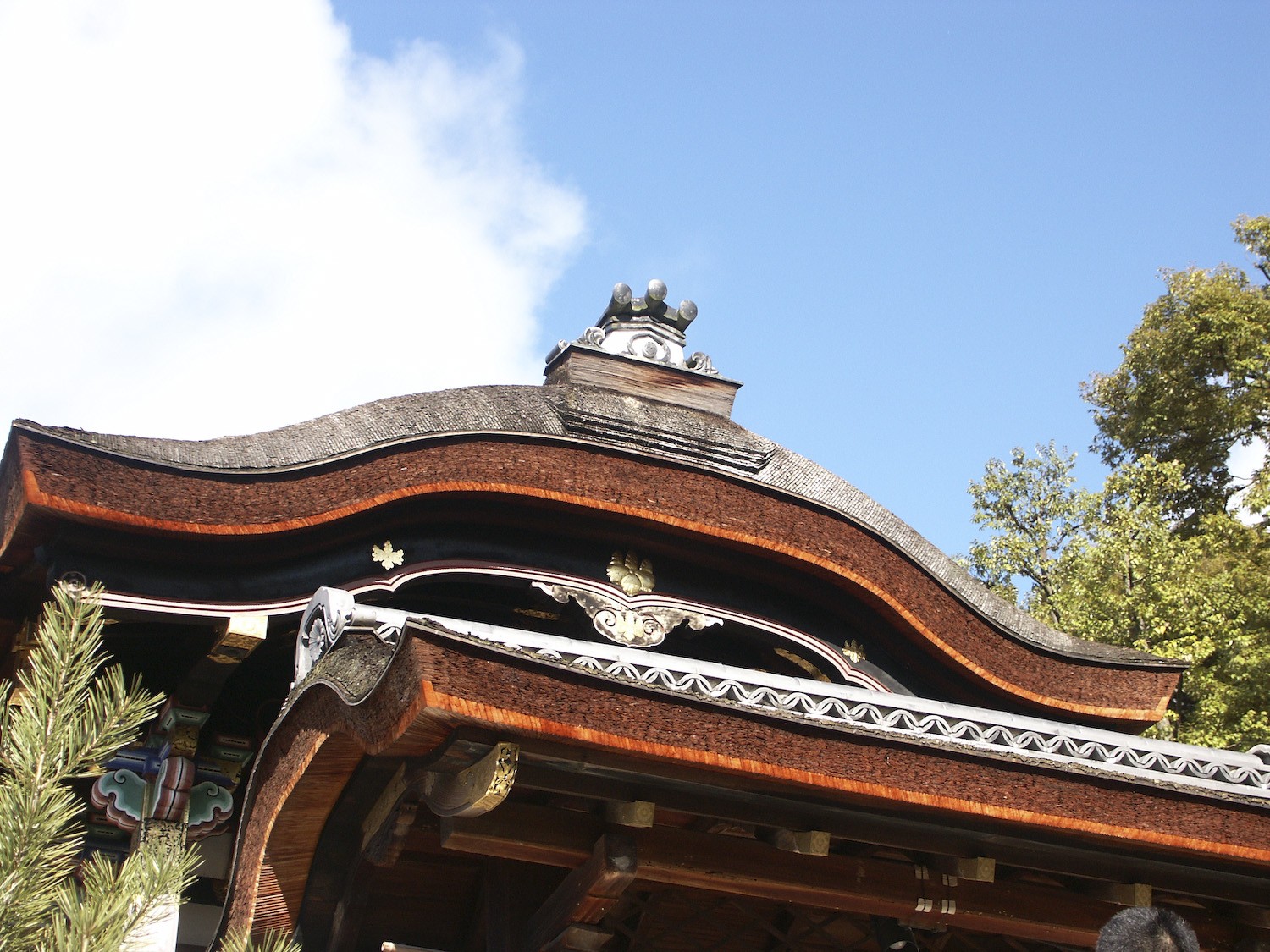
The edge of a shrine roof, the trunk of a pine painted on a Noh stage, a river flowing across a folding screen — the same kind of line turns up again and again in traditional Japanese design.
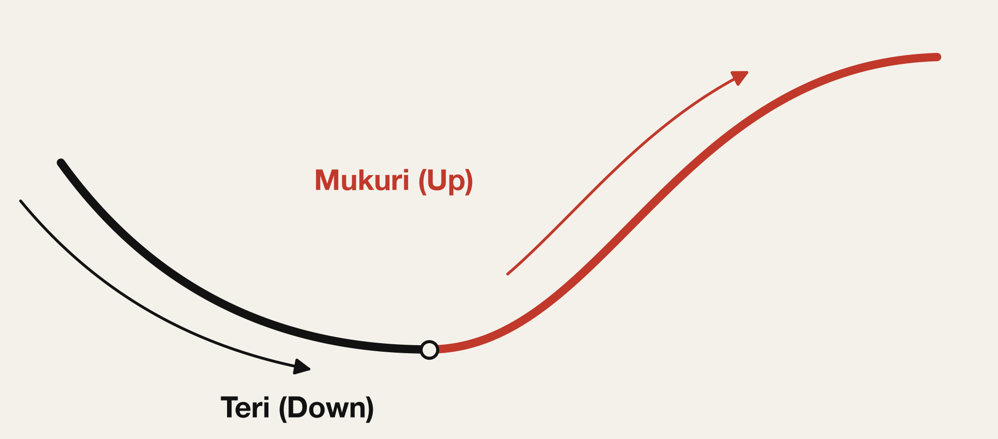
It isn't an arc you could draw with a ruler, and it isn't a slice of a circle you could draw with a compass. It sinks first, then turns and swells upward. And it has a name: terimukuri.
2. What terimukuri is
Traditional Japanese architecture works with two basic curves. Sori is concave — it dips in the middle. Mukuri is convex — it swells in the middle. Sori is also called teri, and the curve that joins the two into one continuous line is called terimukuri.
The clearest example is the karahafu, the curved gable you see over the entrances of shrines and temples. If the goal were only to shed rain, a much simpler roofline would do. The karahafu takes the harder, more expensive route on purpose. It signals the building's rank, and it tells you where the entrance is, drawing your eye toward it — the curve was chosen for what it means, not for what it does.
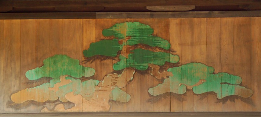
The pine painted on the back wall of a Noh stage, the oimatsu, is drawn with the same curve. The pine is treated as a tree the gods inhabit, and its winding trunk is said to be painted so that it answers the movement of the performer dancing in front of it.
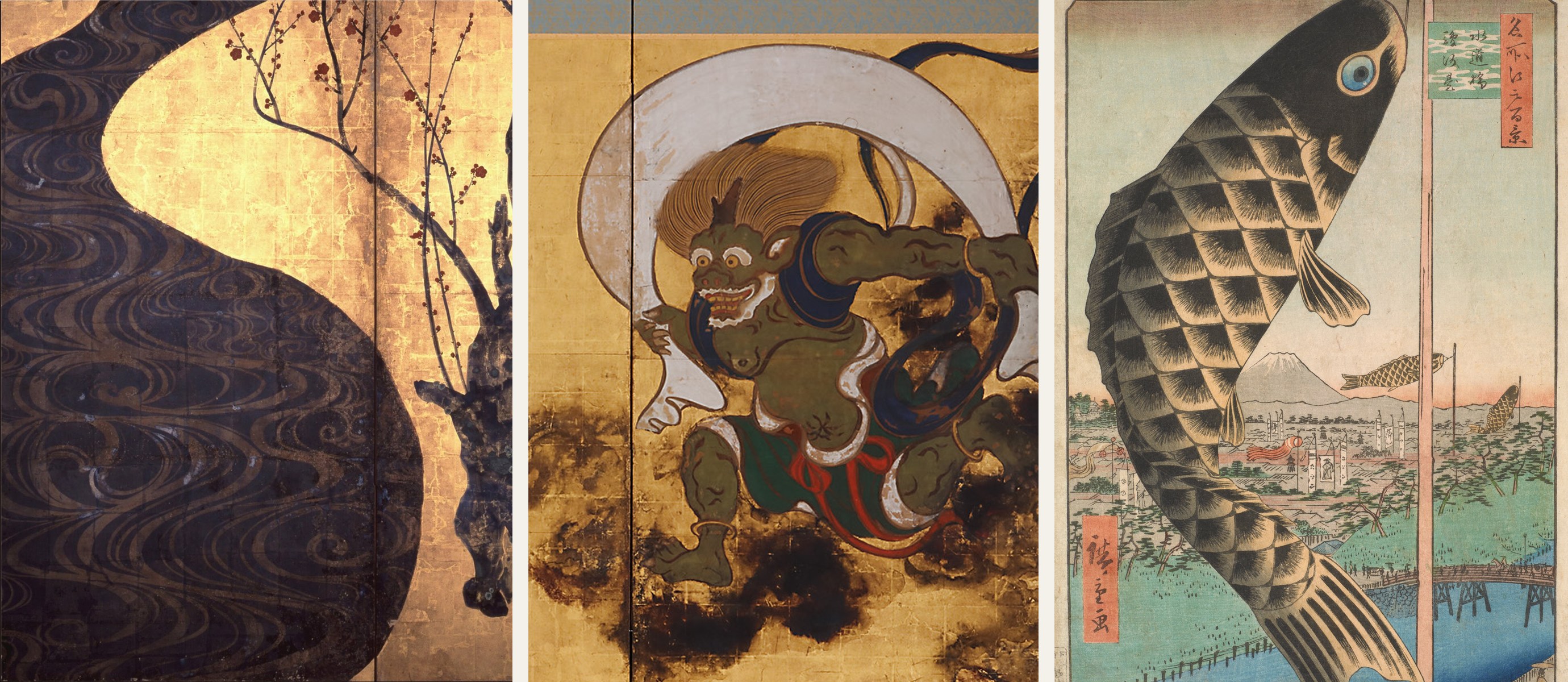
The river running through the middle of Ogata Kōrin's Red and White Plum Blossoms, the sash streaming around the wind god in Tawaraya Sōtatsu's Wind God and Thunder God, the waves and carp streamers of ukiyo-e prints — different forms, all following the same single curve.
3. Why nature takes this shape
So why does the same curve keep getting chosen, across so many different settings?
A book on traditional Japanese design offers a useful way in. Take the way temperature moves through the seasons, and connect it into a single line across the year. Here's what that looks like:
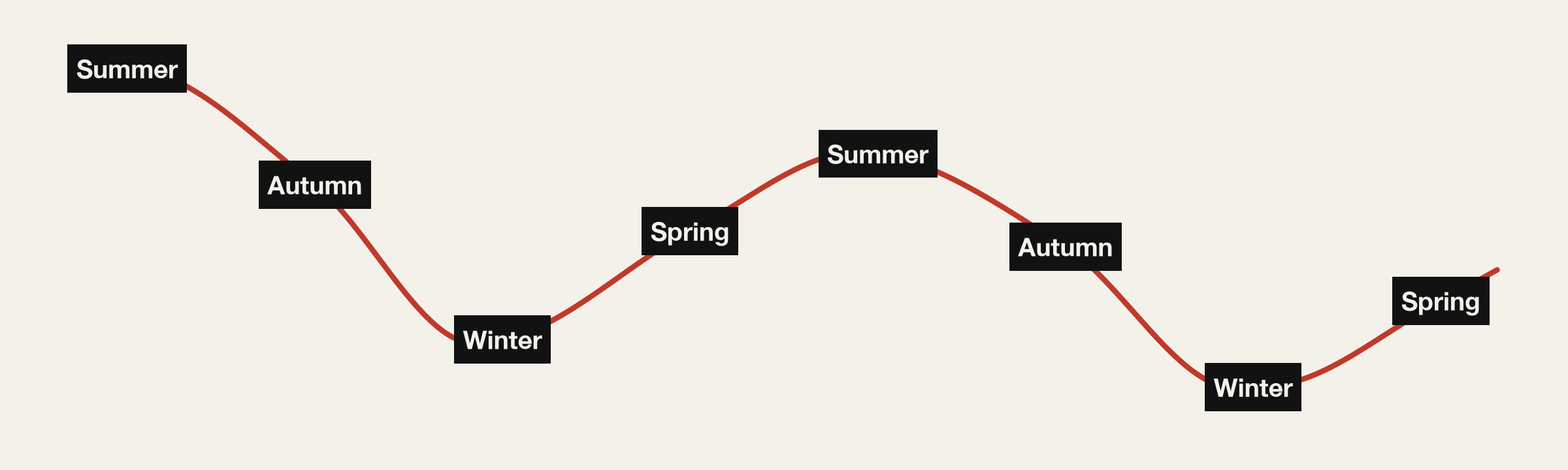
It doesn't come out as a clean sine wave. It comes out as an irregular, rolling line — the same continuous curve as terimukuri. The swell of a wave, the bend of a river, the reach of a branch: none of it is symmetrical.
Terimukuri is a curve that copies that natural order directly.
4. Terimukuri is a kata
That's why terimukuri was never chosen as ornament. It sits on the karahafu, at the threshold between the sacred and the everyday, and on the oimatsu, the tree the gods are said to inhabit, because it holds the movement of nature itself in a fixed form.
A form that gets used again and again, the same way, with its meaning carried along intact — in Japan, that's called a kata. Terimukuri is one of the best examples of one.
5. Looking at the curve as time, not shape
Let's look at the curve itself one more time.
Sori to mukuri — dip, then rise. That describes a shape, but it also describes a movement, one with an order to it. And the temperature line we just looked at wasn't a shape at all; it was change over time. If that line comes out as terimukuri, then maybe what terimukuri really describes isn't a shape. Maybe it's change over time that doesn't move symmetrically.
If so, then when we bring this curve into web design, it's easy to reduce it to a question of shape — how rounded is this corner, what's the border-radius — and keep only half of what terimukuri has to offer.
6. Translating it for the web: designing a curve as speed
CSS animation comes with a familiar easing, ease-in-out. As the name says, it starts slow, speeds up in the middle, and slows down at the end. It's symmetrical — plot it and you get a curve that mirrors itself left to right.
Terimukuri isn't symmetrical. There's no reason the dip and the rise should move at the same speed.
With cubic-bezier(), you can design that asymmetric easing yourself. For example:
/* sink slowly first, then rise with momentum */
transition: transform 0.9s cubic-bezier(0.6, -0.6, 0.25, 1);
The key is the negative second value. It makes the element move the opposite way, just once, at the start — the dip, the sori. In the second half it rises all the way to its destination and settles without overshooting — the mukuri. The movement of terimukuri becomes the animation.
Here's the same button rising on hover, both ways. On the left, A uses ease-in-out; on the right, B uses the terimukuri easing. The graph under each button plots progress (vertical) against time (horizontal), and the dot shows where the motion is right now.
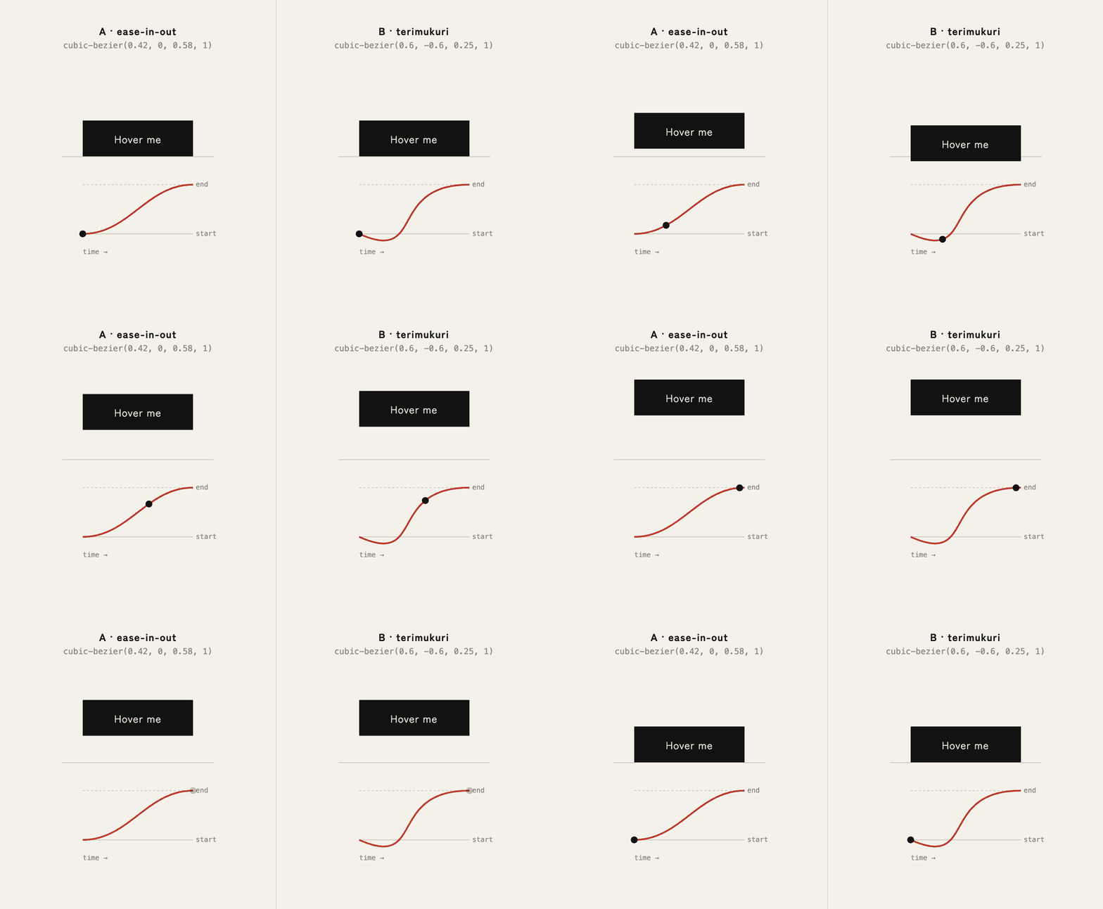
It's worth looking closely at the graph under B. It sinks below the starting line, then rises in one sweep — the same shape as the karahafu at the top of this piece. The curve of a building has become the curve of a motion.
Watch the two side by side and the difference is easy to feel. A simply moves. B looks like it gathers itself first, then lifts off on its own. That's the difference between something that moves and something that seems alive.
The same idea works for cards that appear as you scroll. As each card comes up from below, B dips a little further first, then rises into place.
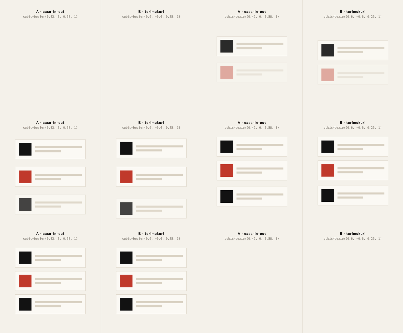
If this looks familiar, it should. Western animation has a name for moving the opposite way before the main movement: anticipation, one of the classic principles of animation — the bend of the knees before a jump. You could say Japanese architecture and painting have been drawing that same principle for centuries, as a shape instead of a motion.
A button rising on hover, a card appearing on scroll, the moment a modal opens — let's apply the terimukuri kata not to how round something is, but to how it moves. That's the translation this piece is proposing.
None of this means every motion should dip. A page where everything sinks before it moves would feel restless, not alive. Save it for the one element that matters most — the button you most want pressed — and that one thing will feel alive.
7. Close
Terimukuri has shaped shrine roofs, Noh-stage pines, and painted screens — it's a kata of form. But look at its order — dip first, then rise — and it turns out to be a kata of time as well.
The next time you're working with curves, it's worth thinking beyond how many pixels round a corner should be — and asking how fast something should move, and in what order. Shaping it isn't enough on its own. Give it that asymmetry in time, and terimukuri starts working as a kata.
Reference
- 成願義夫『和の感性を読み解く 伝統デザインのはなし』(Yoshio Jogan, Reading the Japanese Sensibility: Traditional Design, in Japanese)